Im Maileon Help-Center finden Sie umfassende Dokumentationen zu unserem System.
Beliebte Suchanfragen: Importe | Rest-API | Integrationen | SMS
Landing Page Editor v2.2
1. Introduction
The Landing Page Editor is an editing interface in Maileon, similar to CMS 2.1. It allows you to create pages using a simple drag and drop method.
This service is available within the Maileon system and is completely customisable down to the last detail. It can be used for subscription / unsubscription pages, profile update pages, and to build up any other landing pages to substitute a form for profile editing, subscriptions, questionnaires etc.
The Landing Page Editor does not require a separate integration with your website. All the pages created here will be accessible through the main subdomain of your Maileon account, using the URL ending you add when you create the specific page.
2. Page creation
To create a new page, navigate to Pages » Page Management, then click on the Create page button or the + (add tab) sign in the right corner (fig. 1).

Fig. 1: Create a new page to start the process.
Enter the name of the desired landing page in the marked fields of the pop-up window and select the type of your page in the dropdown list (fig. 2).

Fig. 2: Select the type of your page.
Fill the URL path field to complete the URL of your page. Choose the same term as the selected type of your landing page. Do not use spaces when you insert the file name of the URL path.
Note: Avoid using underscores for your URL. Google recommends hyphens instead, which makes your website more SEO-friendly. Search engines are ignoring underscores as normally separated words in URLs will be interpreted as one word (fig. 3).

Fig. 3: Fill the URL path field to complete the URL of your page.
The type you selected will in the following make the predefined templates available.
Finish the setup of your landing page with a click on Save page.
Your page draft is now created, and you are directed to the page management list, where you can further edit it by clicking on Edit page (fig. 4).

Fig. 4: Start to edit your page draft.
A published landing page can be re-drafted at any time (fig. 5).
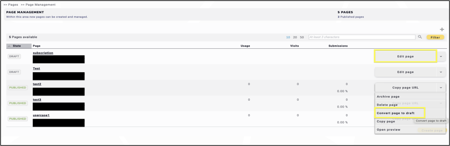
Fig. 5: Convert your page back to draft at any time.
3. Template Selection
In the Template Selection part, choose from different templates that were created for the specific page type you selected. However, you can also choose a blank page and start to build up your page From Scratch (fig. 6).

Fig. 6: Choose from various types of different templates in ’Template Selection’.
Pages library contain the templates you saved earlier. In this example, the library is empty (fig. 7).

Fig. 7: ’Pages library’ contains the templates you saved earlier.
Page gallery contains the sketch templates created by Maileon, which are easy to start working with; modify the template as you desire (fig. 8).

Fig. 8: ’Pages gallery’ contains the sketch templates created by Maileon.
Either way, the editor – in which you can create your own page – will be loaded.
During the editing process please pay attention to the length of your page. Keep it simple and transparent, sharing only the essential information on it. Longer pages require longer loading time, especially while being edited.
4. The editor
4.1. General overview
The following example starts with the template selection From Scratch. After clicking the button you will be directed to the Landing Page Editor (fig. 9).

Fig. 9: Start the process ‘From Scratch’.
On the left side is the surface where you build your page content and layout. In the top left corner, you can switch between the desktop, tablet and mobile view and see the page outline (  ).
).
Use the buttons in the right corner to save or close the page at any point during editing. The rotating buttons (  ) are also located here (fig. 10).

Fig. 10: Save your page and check the differences between desktop and mobile view.
On the right are the different templates that can be added to the landing page using drag and drop. Next to the headline Template header you find the Page settings (  ) icon (fig. 11).

Fig. 11: Next to the ’Template’ header, you will find the ’Page settings‘ icon.
Save the page as a new template or click on the three dots in the right corner to select a previously saved template (fig. 12).
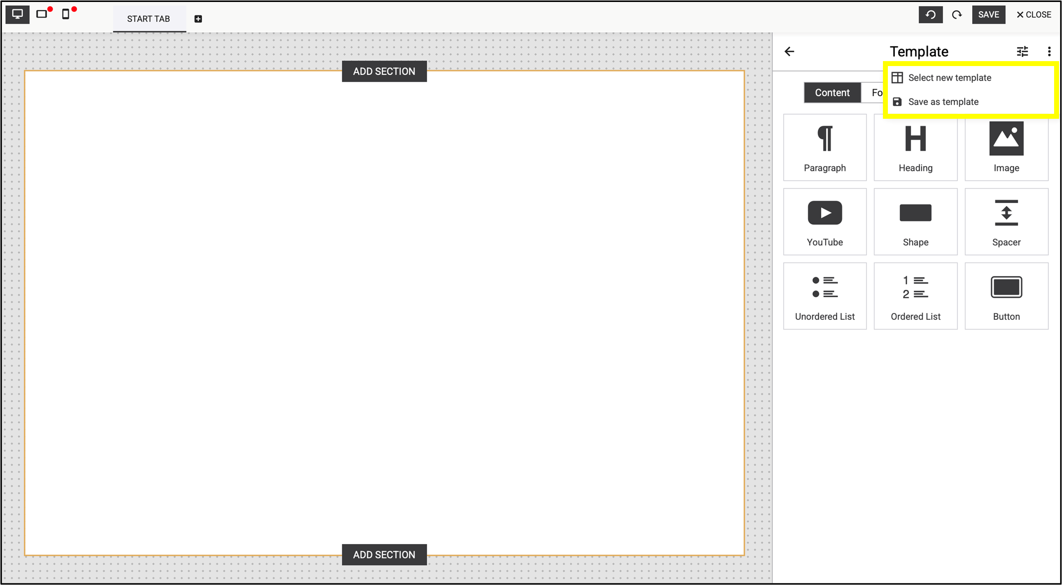
Fig. 12: Select the previously saved templates by clicking on the three dots in the right corner.
After dropping the element, the right panel changes into settings mode. Now you can format the element as desired. Save your change by clicking save in the top right corner of the window.
After saving your work the panel switches back to the template view. Now you can add further section elements and refine the layout of your landing page.
These predefined Content elements, Form Fields and Article Templates help you easily build and customise your landing page via drag and drop.
Using the predefined Article Templates in the tool panel serves as initial ideas to facilitate your work and help you to create your own individual elements. Once you’ve adjusted the settings to your preference, you can save it as a new article template. This way you create your own set of individual templates, for a consistent corporate design (fig. 13).

Fig. 13: The predefined ‘Content’, ‘Form Fields’ and ‘Article Templates’ help you easily build and customise your landing page via drag and drop.
4.2. Section element
After clicking the From Scratch button you will be directed to the Landing Page Editor (fig. 14).
The Section option on the interface increases the efficiency and effectiveness of creating landing pages. Its modularity divides the page into multiple, separately editable surfaces for quick and flexible customisation, allowing sections to be added, removed, or rearranged easily.
Predefined sections, such as the header and footer can be reused, saving time and ensuring consistency.

Fig. 14: ‘Section’ is now part of the basic settings in the updated version of Landing Page Editor.
You can easily select the focus areas with a double click. The width of a section is fixed and matches the width of the page, while the height can be freely adjusted by moving the blue slider at the bottom of the section or by selecting fixed dimensions (fig. 15).

Fig. 15: The height of a section is adjusted automatically or can be corrected manually.
The toolbar within the section makes editing easy (fig. 16). Use
- the arrows (lift buttons) to move quickly and easily between sections,
- the double square icon with the + sign to copy,
- the trash can icon to delete the section.
- The X button resets the section to its default state.
The menu on the left contains the style settings for the section, such as
- spacing,
- background,
- border, and
- text.
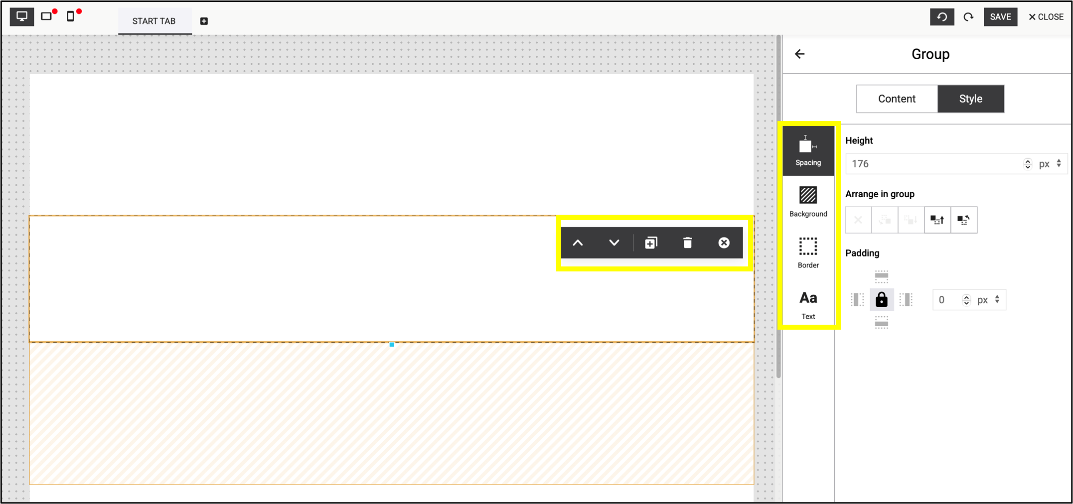
Fig. 16: Simple and user-friendly toolbars are available for editing the selected section.
Note: These are the default tools in the Landing Page Editor, which are also available in the standard version.
4.3. Editing method
Move the new element by clicking on the blue circle in the middle of the element (fig. 17).
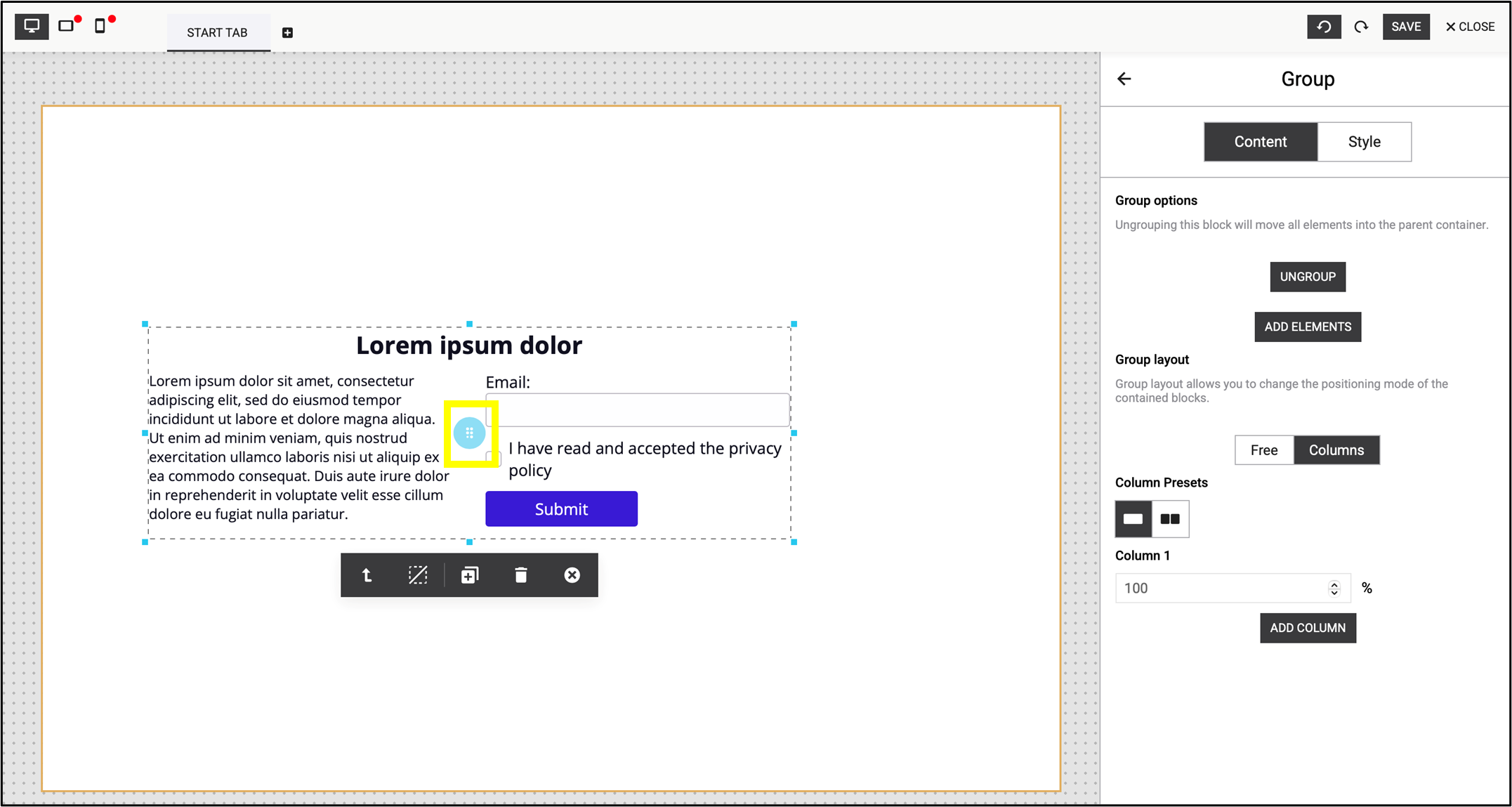
Fig. 17: Use the blue circle to move the element.
Once you have added a new element to the page, customise its Content or Style by clicking on it in the editor window. When the element is active, you are able to change the settings in the right panel. The block can be edited either as a whole or in individual parts.
Note: You can only change the label if you have previously selected it (fig. 18).

Fig. 18: Select the label before editing it.
Modify the text content within the elements separately by selecting them. In addition to the general formatting options, you can also add a link or a contact field. Figure 19 shows an example of adding a contact field.

Fig. 19: Text editing options, highlighting the addition of a contact field.
Edit the entire block with customizable Style elements (e.g. size, shading, font, etc.). The direct panel settings allow you to edit the interface separately on the selected text block.
Note: The direct panel settings override the side menu (fig. 20).
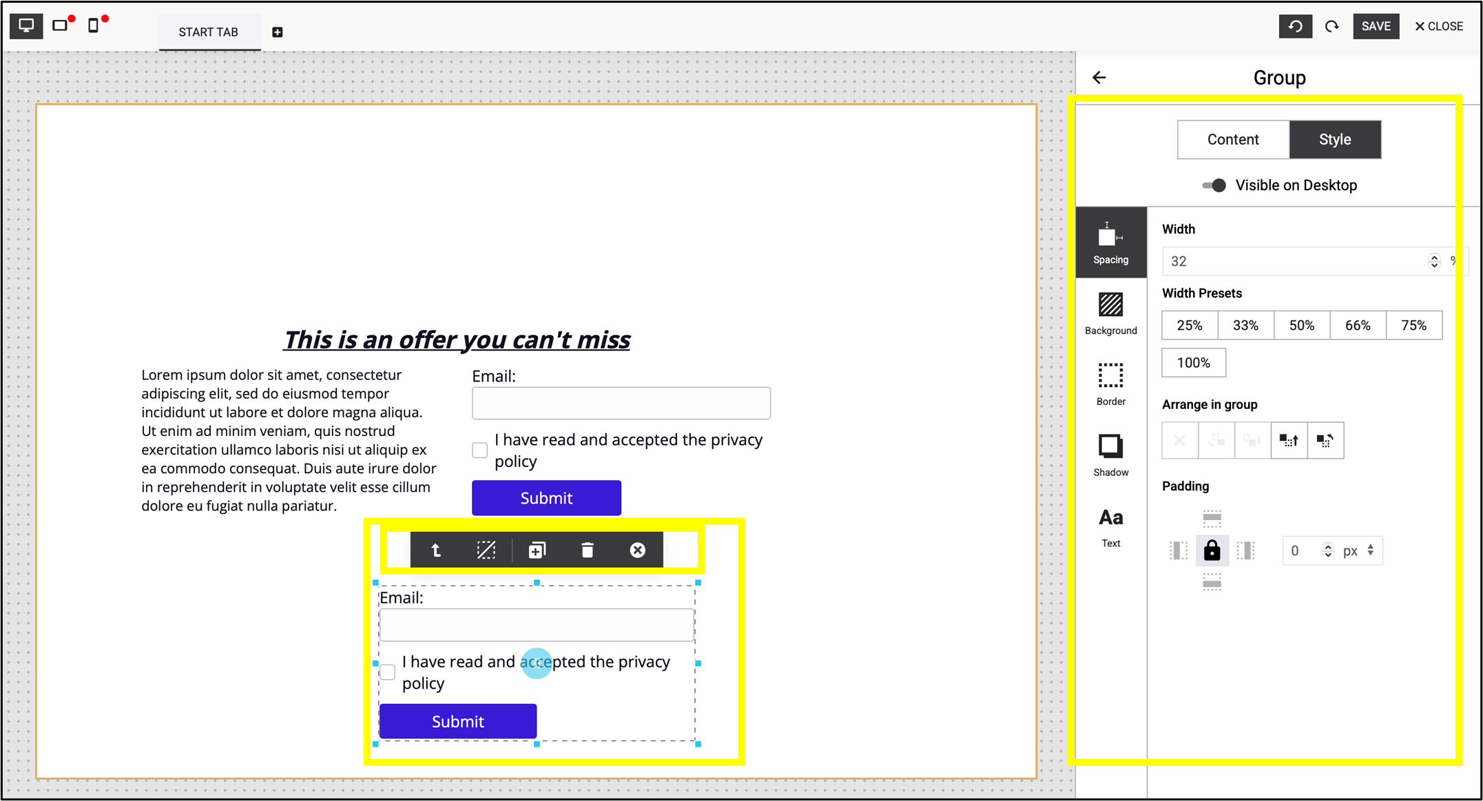
Fig. 20: Settings of the direct panel and the Style menu.
Edit the entire block with customizable Content elements where you have the option to group, ungroup or add new elements optionally (fig. 21).

Fig. 21: Flexibly arrange blocks into groups or break them down into individual elements.
Clicking the ungroup button separates the article template into individual elements, allowing each element to be moved, edited, or customized independently (fig. 22). Clicking on the group button will rearrange the elements into groups.

Fig. 22: Click ’group’ to reorganize the elements into groups.
Hold Shift to select individual elements, which can then be arranged into blocks by clicking on the group button (fig. 23).

Fig. 23: Hold Shift to select elements, then click ’group’ to arrange them into blocks.
Grouping makes it easy to adjust column layouts and add new columns to blocks (fig. 24).
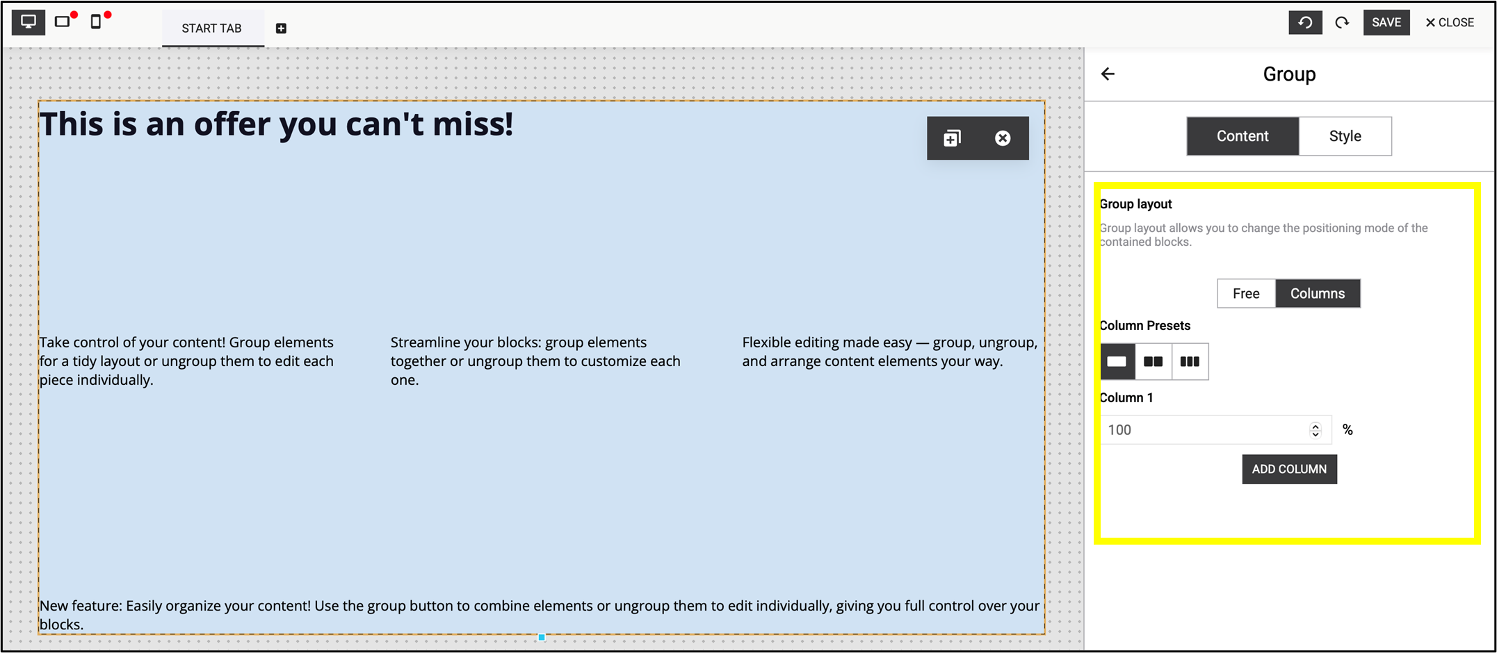
Fig. 24: Grouping elements makes it easier to modify columns.
Once you add a new element to the page you have the option to ungroup / group it in the direct panel settings by clicking on the appropriate icons (fig. 25).
Group: 
Ungroup: 
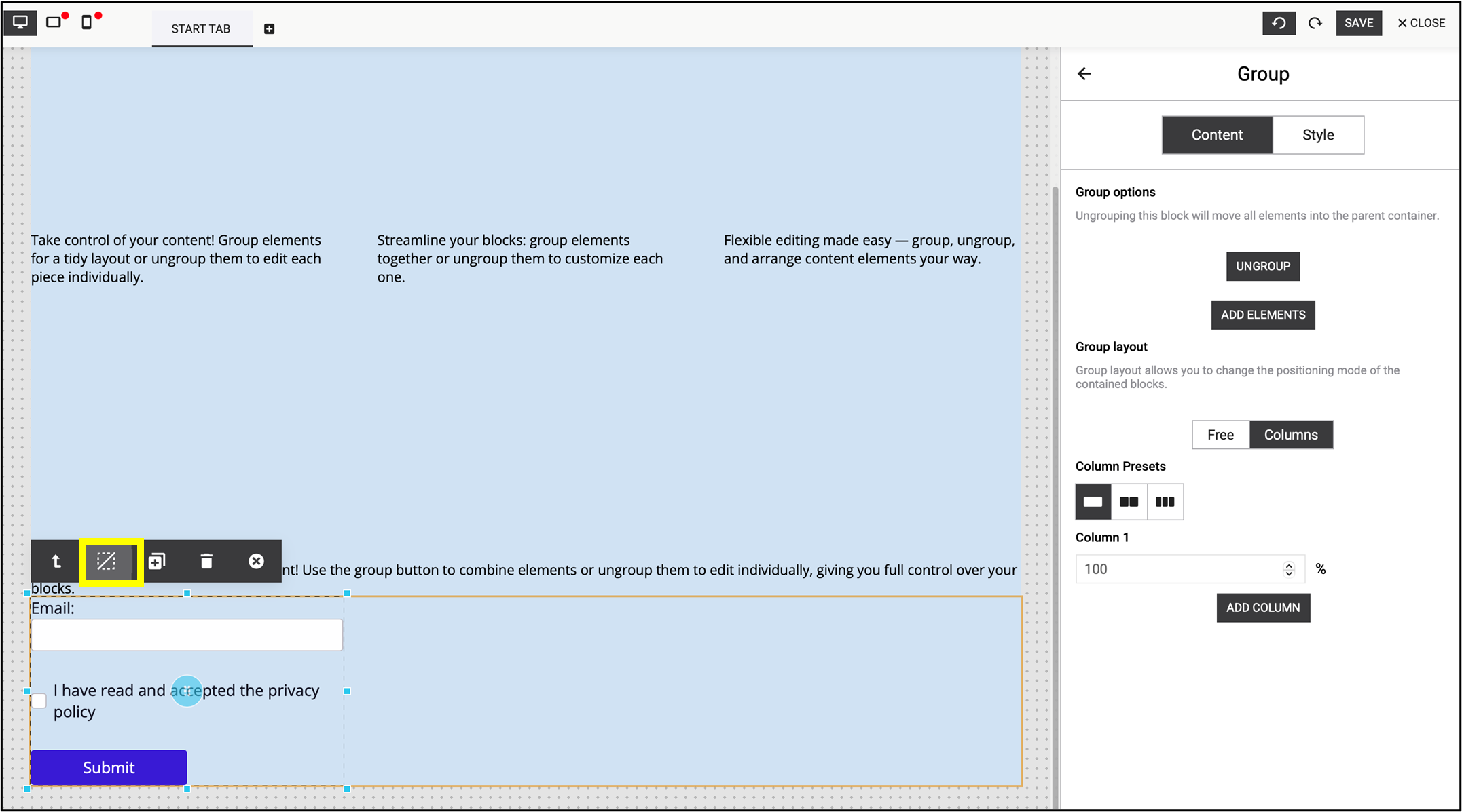
Fig. 25: Group or ungroup a new element on the direct panel as needed.
4.4. Mobile view check
The mobile view does not always adopt the style notes and layout set up in the desktop view. Instead, the elements may appear one below the other. Therefore, during the editing process always check the mobile view in parallel with the desktop editing.
This example shows the difference between desktop view (fig. 26) and mobile view (fig. 27).

Fig. 26: Desktop view: Always check the mobile view in parallel with the desktop editing.
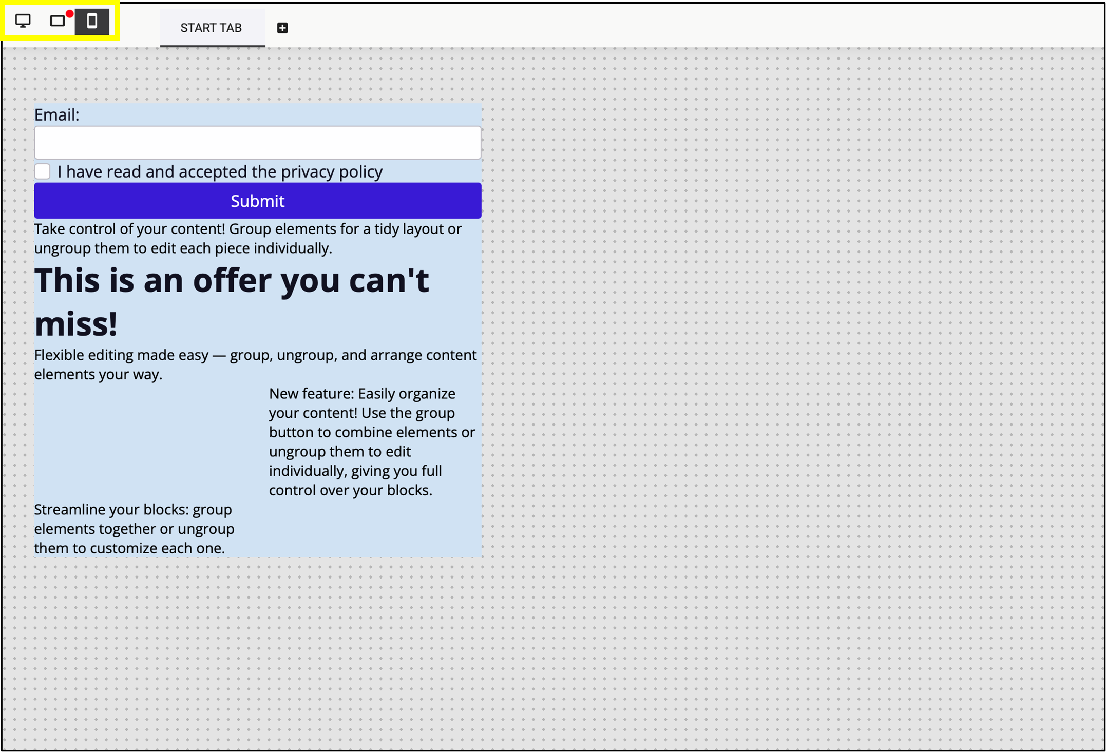
Fig. 27: The mobile view does not always adopt the style notes and layout.
4.5. Form element
In the Article Templates you are able to add a Form element to your page if you would like to create a subscription or profile update page. Once you add the Form element, an email input field and a checkbox will be added to your landing page.
Select the Form type by clicking Submit (fig. 28). In all cases – except for unsubscribing – this is the Signup.
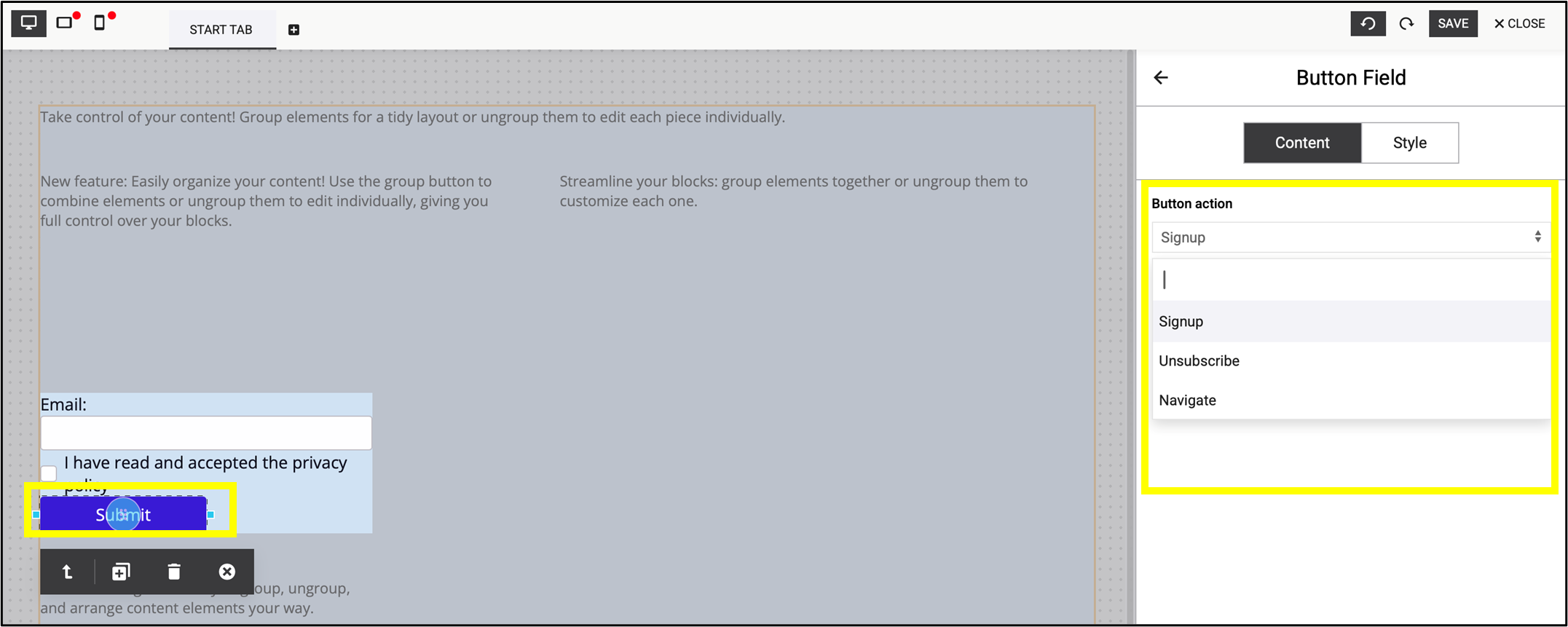
Fig. 28: Select the type of the form by clicking ’Submit’.
After selecting the appropriate Form, click on the icon in the right corner of the screen. It opens the Page Settings (fig. 29).
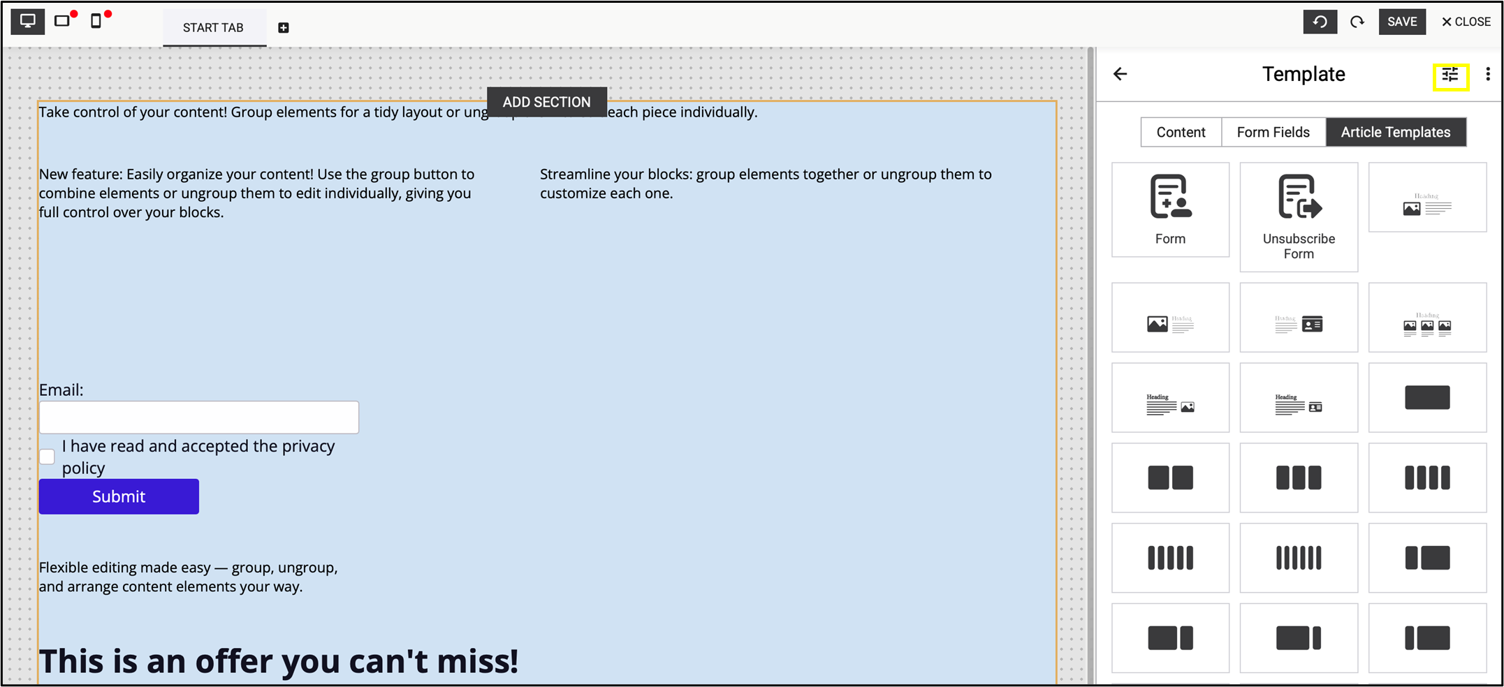
Fig. 29: Open ’Page Settings’ in the top corner.
4.6. Page settings
Change the global settings of the page in Page settings. Here you have the opportunity to
- add Meta tags of your page (title, description and language),
- customise the success page and error page in Form Defaults,
- change the Style of the page (e.g. background color, font size, link color, etc.)
- copy a unique URL (e.g. from your website) or Analytics IDs,
- link previously created pages by the Landing Page Editor, or
- add contact details to your page.
Set the default success page and default error page under the Meta option (fig. 30), along with the basic settings of the page.

Fig. 30: Change the URL of the success and the error page in Form Defaults.
Set the standard colors of your page quick and easy in Style (fig. 31). Here you will find preset, frequently used standard colors that apply to different elements of the page, which can be modified as needed.

Fig. 31: The most used standard colors are preset in ‘Style’.
Note: Colors set here will be applied uniformly to the selected elements on the page (fig. 32).
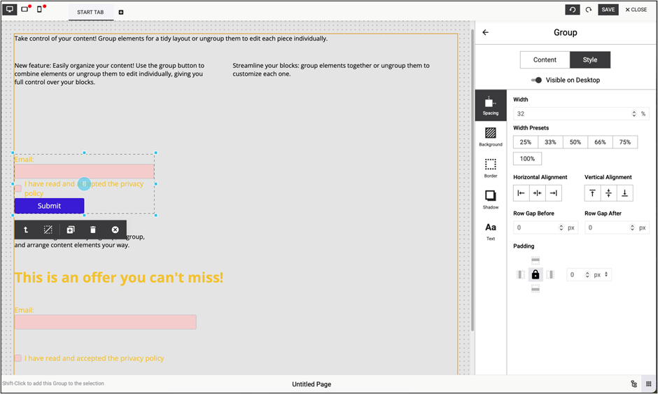
Fig. 32: The selected page elements use the same colors, applied uniformly.
Similar to colors, you can set a Font Family, Font size, and Color of paragraphs uniformly (fig. 33).

Fig. 33: Similar to colors, set paragraph font, size, and color uniformly.
Different Analytics IDs can also be inserted in the Page settings to link the landing page to different analytics software (fig. 34).

Fig. 34: Different Analytics IDs can also be inserted in ‘Page settings’.
If you use the landing page for subscription or for profile updating, enter your contact settings in the Page settings section. Enable the DOI process after subscribing and add the permissions for contacts here (fig. 35).

Fig. 35: Enable the DOI process after subscribing and add the permissions for contacts.
4.7. Add new fields and hide existing fields
Add new input fields and checkboxes at any point during editing the form from the Content elements in the right panel. Fill in these fields in your form.
The input field can be duplicated by clicking on the field and using the duplicate block icon (  ). After duplicating, edit the block or the field directly (fig. 36).

Fig. 36: Duplicate an input field with the duplicate block icon.
When the input field is active, you can also change its settings in the right panel. The input field can be linked to an existing Maileon contact field as well: when the user fills the form, the data is saved in the contact fields you add here.
If you are using a hidden field, drag the Visible on Desktop slider in the right panel after selecting the field you want to hide (fig. 37). This method works for all device views.
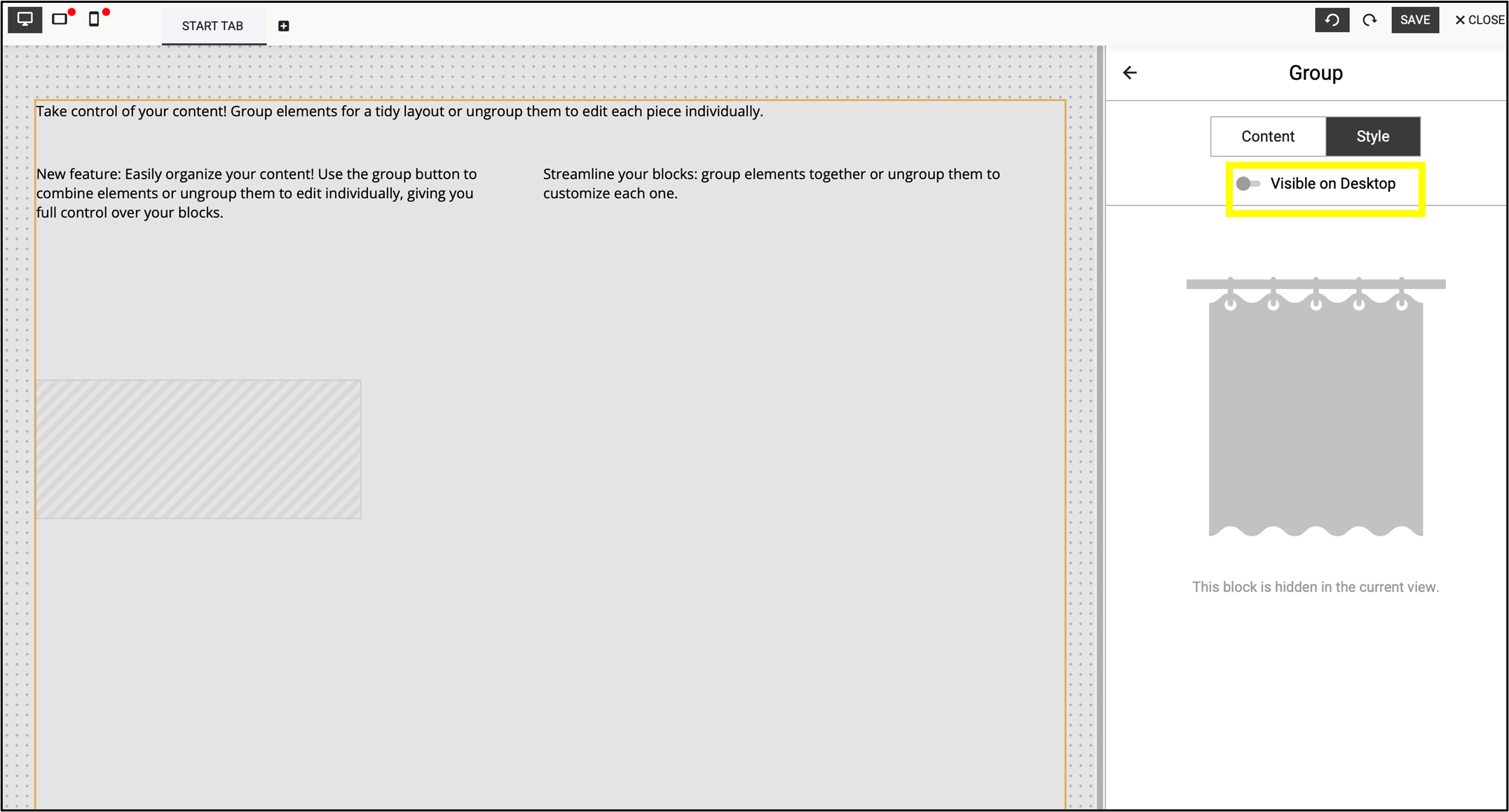
Fig. 37: You can use hidden fields by dragging the ’Visible on Desktop’ slider.
4.8. Toggle tree view
By clicking on Toggle tree view in the bottom right corner, it shows how the elements are structurally stacked on the landing page.
Use the eye icons in the branch diagram to create hidden fields. This can be adjusted separately in the mobile and tablet settings. As indicated earlier, hidden fields can also be created in the right panel by using the Visible checkbox after selecting the field you want to hide (fig. 38).

Fig. 38: Use the eye icons in the branch diagram to create hidden fields.
Note: In Usecase 2 hidden fields are further discussed through a practical example.
5. Create additional pages
Add more pages to the landing page using the + (add tab) icon on the left of the screen (fig. 39).

Fig. 39: Add more pages to the landing page with one click.
Edit the page freely or clone the content of the previous pages and save your own template (fig. 40).

Fig. 40: Edit freely, clone content from previous pages, or save your own template.
6. Finishing up
Save the landing page at any point of the editing process. When it’s ready, publish it to your account’s Pages list with a single click. Mini statistics about usage, visits and submissions are also provided here (fig. 41).
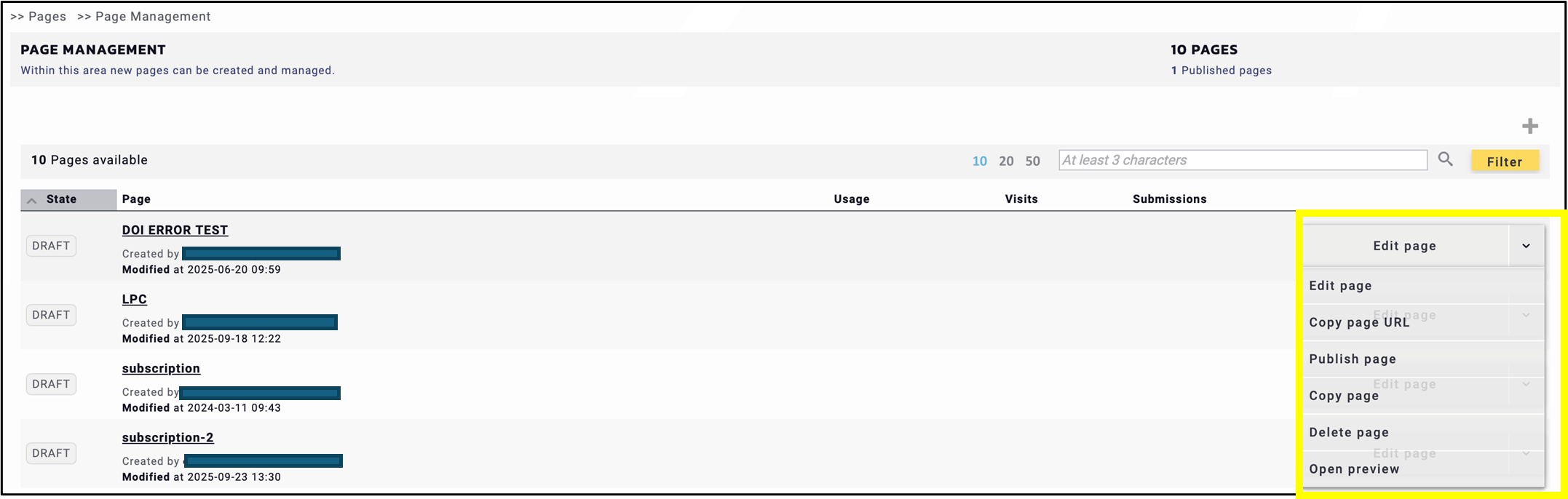
Fig. 41: Save the landing page at any point of the editing process.
At the end of the process, you receive two links to your landing page. The general link at the top of the page is useful for other interfaces, such as social media.
The parameterised link at the bottom of the page is for newsletters, e.g. to implement a profile page with the right authentication / parameters (fig. 42).

Fig. 42: Use the parameterised link (below) in newsletters and the general link (top) in other interfaces.
Note: This documentation provides a general overview of the Landing Page Editor. For further informations please find the LPE use cases in the Help Center or contact us at support@xqueue.com — we’ll be happy to assist you.