Im Maileon Help-Center finden Sie umfassende Dokumentationen zu unserem System.
Beliebte Suchanfragen: Importe | Rest-API | Integrationen | SMS
3. Inhalt im Editor2.0 bearbeiten
App Panel
The App Panel on the right-hand side is fundamentally new. Here we provide you with a wide range of design options. The number and scope of the apps are constantly being developed. The apps allow you to work on your emailing in a way that is both creative and technically sophisticated. Below you will find an overview of the apps available to date with detailed explanations and examples of the most common applications.

Fig. 1: The ‚App panel‘ offers various apps for the creation of your mailings.
The search bar and the filter button on the right side will help you find the app you are looking for. After clicking on the filter button, further options are displayed. Here you can filter by category using the dropdown or display your favorite apps separately using the checkbox.

Fig. 2: Choose your favourite apps for quicker access.
Template
The app panel contains all the applications you need to work in Editor2.0. Use the Template app to edit the design of your emailing. The template collection is constantly being expanded.

Fig. 3: Open the ‚Template‘ app to design your mailing.
Click on the Template icon to open the app. Numerous tools such as widgets and ready-made blocks are available here. You can customise each widget and each block according to your own wishes and afterwards save it as a new element. This allows you to gradually create your own individual style library. You can also define the basic settings for your emailing here.
Template Settings
Click on the slider icon to the right of the Template header bar to access the basic settings for your emailing.

Fig. 4: Open the settings of the ‚Template‘ app with click on the slider icon.
In the basic settings, you define the basic layout for the entire emailing. The settings also apply to the content elements it contains, such as widgets and blocks, but can be changed individually.

Fig. 5: Basic settings of the ‚Template‘ app.
As a first step, define the global key points for a uniform layout and the framework of your emailing, including:
- Sections: One or more areas with different widths if necessary (subdivision e. g. into content, header and footer areas).
- Title of the emailing: automatically as a text module or individually defined.
- Breakpoints: Depending on the size of the output screen, the system switches to the corresponding layout (desktop, mobile, tablet, etc.) at the breakpoints set up.
- Background: color design, frames and images.
(Please note: clients such as Outlook do not support this function). - Tracking pixel (also called pixel tag) and/or an overarching tracking parameter to collect user data and create web analyses via various providers.
- Default buttons: Specify the basic appearance of buttons.
- Locking the design against changes.
- Text synchronization: Settings for creating an HTML-free text version.
Use the arrow at the top left of the heading bar to return to the template overview.
Template change and download
Click on the three dots on the right-hand side of the heading bar to open a submenu with further actions relating to the template. Here you can exchange, save or download the dispatch template. You can also mark the current Template app as a favourite.

Fig. 6: The 3-dot-icon leads to further template options like ‚Change template‘.
Options menu of the Template App
- Change template: This command opens the change options for the template in a pop-up window. The new template can either consist of the template gallery, your own saved dispatch templates, an imported HTML file or a blank page.

- Add to saved templates: You can save a self-made template at any time. Please enter a name (min. 3, max. 64 characters) in the pop-up window and add tags to further categorise your template if required. Tags structure your content and make it easy to find it later. We have set up a default folder for you as a basis. You can of course extend the folder structure with subfolders as desired. For more information on the folder structure and a step-by-step example, see chapter „Individual Blocks„.

- Download template: Templates can be downloaded as a ZIP archive with or without HTML markup for the template language. Marking the template language enables the Editor2.0 to recognize and edit WYSIWYG blocks, but the HTML is not readable for other HTML clients. If you intend to import the exported template into another account, we recommend that you retain the markup. If you want to export a working HTML file, please tick the option to remove markup.
If you want to re-import this template into another account, please note that the file size for ZIP archives is limited to 10 MB.
-
-
- Download as image: With this command, the entire template is prepared as a PNG file and can then be saved.
- Download as PDF file: You can download your template with or without page breaks. This allows you to pass on the design, e. g. for presentations, votes or corrections. Links remain active.
- Favor this app: This action marks the current app in the overview with a star symbol. When filtering the overview, you can e. g. just display your favourites.
-
Widgets
In the Widgets area, you will find basic structural elements for designing your content. Drag and drop the selected element to the desired position in your emailing. As soon as you click on a widget (Fig. 7, 1) and drag it into the layout window (Fig. 7, 2), blue areas appear to indicate where you can place it. Release the mouse button to insert the widget at the desired location (Fig. 7, 3).

Fig. 7: Drag and drop a widget from the app panel into the layout window.
Text
After the positioning of your widget in the draft, you can edit it. We will show you the range of functions using a text element as an example. To do this, click on the text element once. A blue marking line and a small context menu appear in the layout window. At the same time, the view of the right-hand app panel changes and shows the associated editing options depending on the type of widget.

Fig. 8: Click on an element in the layout window to open the context menu (1) as well as the app panel options (2).
This provides you with two editing menus containing different options: the context menu bar within the layout area and the app panel on the right.
When you click on an element, a small menu bar with selected options appears directly in the layout window (the number of command icons may vary depending on the type of element). Here you can duplicate, lock or delete your element, group it with other elements or change the visibility settings, among other things. You can also format text here.
There is a significant difference to the app panel on the right: In the context menu you can format and link individual character strings (words, lines, text passages) separately, whereas changes in the editing panel always affect the entire text block. To access text formatting, click on the pencil icon. The menu bar is initially displayed in a single line. To see the full range of commands, please click on the 3-dot icon on the right.

Fig. 9: Click on the 3-dot icon on the right to display the entire context menu options.
The following commands are available in the context menu:
- Bold
- Italic
- Underlined
- Bulleted list with dots
- Bulleted list with numbers
- Superscript/subscript
- AI text wizard
- Insert image
- Insert link
- Insert placeholder
- Undo/Redo
- Menu expansion or reduction
- Font type
- Font size
- Headings with and without table of contents marker
- Text alignment left-center-right-justification
- Text colour
- Background colour
- Strikethrough
- Insert emoji
- Insert symbol
- Insert horizontal line
- Insert white space
- Insert unformatted text
- Insert text from Microsoft WORD (with formatting)
- Spell check
- Remove format
- Show HTML code editor
app panel options
This is where you define all the settings that affect your element as an entire block. You will see the headline Text (fig. 10, 1) in the center of the title bar. The 3-dot icon on the right leads you to the submenu (fig. 10, 2) with the saving options for the element. The arrow on the left with the word „Template“ takes you back to the higher-level Template menu (fig. 10, 3).

Fig. 10: The heading area of the app panel.
Via the 3-dot submenu (fig. 10, 2) you can
- download the block or element as a ZIP archive,
- save the block in your own folder,
- copy the format of the block to the clipboard and transfer it to another element and
- transfer the style with the whole formatting set to all similar elements (here: text blocks).

Fig. 11: Find the text block options behind the 3-dot-icon.
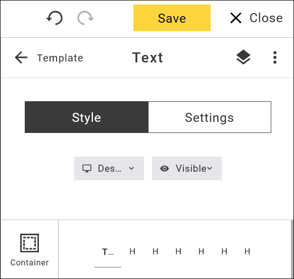
Below the heading area, the panel menu is divided into the two parts Style and Settings. In the Style area, you edit the layout and the visibility of the element in different modes (e. g. Desktop or Mobile).
Settings: Define the behaviour of the text block
In the Settings area, you define the behaviour of the element, e. g. assign a different internal title, define the element as an anchor link for an internal table of contents, set further conditions for visibility, program loops or evaluation via web analytics.
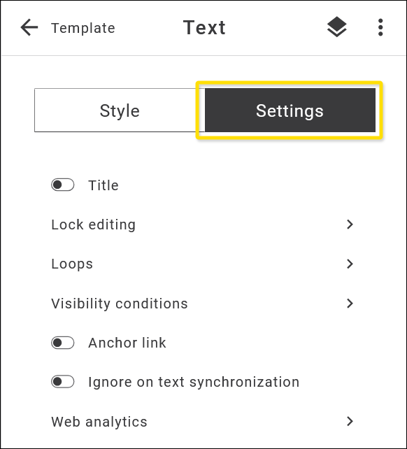
Fig. 12: Assign different actions to your text block, such as an anchor link.
Style: Formatting the text element
Colours, fonts, frames, backgrounds, spacing, arrangement: give your creativity free rein. You can also create customised layouts for different screen modes (desktop, mobile, light and dark mode). When you start editing, the mode is set to Desktop by default. You can also define a completely independent layout for each mode, which gives you extensive creative freedom.
As some formatting that you make in desktop mode is inherited by the other modes, we recommend that you check the layout of the different modes in the preview from time to time. This allows you to recognize unwanted layout changes in the other modes and adjust them if necessary.

Fig. 13: You can define individual style settings for different modes.
Vertical formatting bar
In the formatting area below, you will see a vertical menu bar on the left. The active menu item is highlighted, and the corresponding options are available to the right. Make your desired settings here.
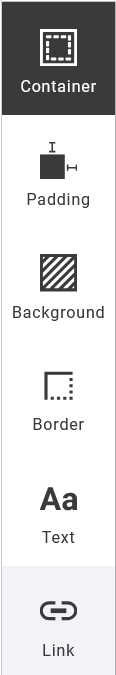
Container: The container is a rectangular block in which the content is located. This is where you set the height and alignment.
Padding: Define the inner distances between the content and the borders of the element. You can make separate entries on all four sides or select a setting for all sides using the padlock icon.
Background: Here you define colours or images for the background of the element.
Please note: Background images are not supported in Outlook clients.
Border: Draw a border around your element here. You can vary the colour, width, line and rounding of the corners and specify whether the border line should be visible on individual or all sides.
Text: Format your body text and headings. The text editing functions are presented in detail below.
Link: This is where you set the appearance of links.
Please note: The link target itself is entered via the context menu, as the text to be linked is usually only a specific character string within the whole text.
For the text design of your element, you can set the format for the normal continuous text and for the headings H1 to H6.

Fig. 14: Text formatting options for the whole text block in the app panel.
The following options are available to you (in the tool you will access the remaining options by moving the grey scroll bar on the right-hand side downwards):
- Font: Select a font or font group from the drop-down list. To use your own web fonts, use the Web font manager app.
- Size: Set the font size here.
- Color: Select the font colour from the colour palette, themes and colour libraries offered. You can also specify the colour directly as a hexadecimal or RGB value. The last used colours are offered in an extra line below the colour palette.

- Letter spacing: To emphasize text, you can change the spacing (distance between letters).
- Line Height: Vary the line height to adapt your text paragraph to an adjacent image for example, or to generate spacing between headings and body text.
- Alignment: Align your text left, right, centered or justified. The „X“ removes the formatting.
- Styles: Bold and italic formatting.
- Decoration: Underlining and crossing out. To save your changes, please click on the Save button in the Editor2.0 header. This button shows a yellow background if there are still unsaved work steps. After saving, the background of the button turns grey.
Image
Just as with a text block, clicking on an image block (see blue marking line in Fig. 13) opens the associated editing menus, firstly the menu bar directly on the picture (Fig. 13, 1) and secondly the functions in the app panel (Fig. 13, 2).

Fig. 15: Context menu and app panel menu for an image element.
Image: context menu
You can use the small context menu bar directly on the image to perform the following actions (see icons from left to right):
- Select adjacent elements: For simultaneous editing or grouping of several elements into one related block. When you click on this icon, the marking line turns yellow. If you now click on an adjacent block, it will also be outlined in yellow. At the same time, this action changes both the menu bar and the panel view on the right and displays the commands that are now available.

The menu bar now contains the cancel, duplicate and delete command icons (from left to right). - The app panel on the right shows in the title that 2 elements are selected („2 Selected“), and below the associated editing options:
- Group in a block: You can combine multiple elements into one block and edit and save it as a separate block. This command makes editing your emailing much easier. Please note that this command changes the structure of the selected elements and cannot be undone after saving. It is therefore no longer possible to insert, remove or move new blocks within the received block. However, the previously contained elements can still be edited individually.
- Lock editing: Here you can either lock the design of the selected elements or the design and the content.
If both are locked, the element remains visible in the Editor2.0 but can no longer be selected.
If only the design is locked, the style and layout cannot be changed, but images, URLs and texts can be updated.
The inheritance rules for future style changes by higher-level elements also change. These are adopted unless the element already had its own styles before it was locked.
Please note that locking can no longer be undone once your emailing has been saved. - Spacer: Insert a space between the selected elements. After inserting, select the element again ito be able to edit it. The style can be changed in terms of height, colour and frame.
Otherwise, the same additional settings and options are available for this element as for a text or image element. - Divider: Set up a separator line between selected elements. After inserting, select the element againto be able to edit it. In terms of style, you can change the height, line type and colour of the separator, give it a background or draw a frame around it. The same options are available here as for other widgets (e. g. text or image blocks).
Image: app panel options
All other image editing options are located in the app panel on the right as follows.
Top menu bar:
In the centre of the header bar, the title tells what type of element you are currently editing. On the left is the link back to the next higher level with a description („Template“), on the right the 3-dot icon lead to a submenu with further actions. Here you can download the image block, save it as your own block, transfer the style of the block to the clipboard and apply it to one other or all image elements of your newsletter.

Fig. 16: The 3-dot icon leads you to the image block options.
Content:
The first steps take place in the content area. Add the image to the image block by uploading it from your local drive, selecting it from the media library or uploading it to your account from your smartphone. Click on the image to edit it.

Fig. 17: Image options in the content area of the app panel.
- Image editing (brush icon): Here you can open the image editor with additional design options. In addition to general image editing options such as cropping, rotating or flipping, various filters are also available. It is also possible to place additional elements such as text on the image (see editing window in the image below). When the modified image is accepted, the dispatch content is updated with the modified image. This is saved in the background as a new version of the original image.

- Media library (folder icon): In the media library, we offer you a customisable and easy-to-use folder structure for uploading and managing all your media files.

We also provide you with numerous sample graphics, images and animated GIFs free of charge and licence-free. You can access two apps with graphics, GIPHY and pixabay.
- Image upload (cloud with arrow icon): Simply upload the desired image from your local drive using drag and drop or select a file using the search function.
- Load picture from smartphone (camera icon): By scanning the displayed QR code, you will be redirected to a page where you can upload a picture from your smartphone directly into your Maileon account.

- Permitted formats are: JPG, PNG and GIF.
- Delete (bucket icon): Use the bucket icon to delete an image.
- Alternative image (3-dot icon): Use the three-dot icon on the right to select an alternative image, for example for vertically aligned mobile screens. This separating option gives you the freedom to optimise your layout in terms of screen formats.
- Alternative text and title: For SEO optimisation and accessibility, please fill in the fields for the alt text and the image title. The alt text describes what can be seen in the image, while the image title text should relate to the content of the newsletter.
- Link: You can also assign a link to the image.
Style:
With a few exceptions, the Style area for an image block is the same as for a text block. Adapt the image block to your newsletter layout, including the width and height, distance to the edge, alignment of the block, frame lines, background colours and images, or rounded corners.
Please note: the last two features (background colours/images, rounded corners) are not supported by Outlook clients.
In the style area, you also define display options such as visibility or different settings for the desktop and mobile versions.
Settings:
The settings options are the same as for text blocks (see chapter „Editing a textblock“ above).
CTA-Button
Use attractively designed call-to-action buttons to invite your readers to click on your links. We have created a special widget for this purpose, which you can use to conveniently set up your link button design. As the basic layout of buttons can already be standardised in the settings of your mailing template, you can also save a combination of editing steps in the Style area.
Drag and drop the Button widget to the desired position in your emailing.

Fig. 18: The ‚Button‘ widget comes with an adaptable pre-set design.
As soon as you have placed the button, you can edit it directly in the app panel.

Fig. 19: The context and app panel menu offer different actions.
As with all elements, there are also two menus here: the context menu directly on the element offers the usual basic options for the arrangement in the emailing (see image block). In addition, another command is displayed here as soon as the button element is part of a larger structural structure, e. g. a multi-column block with text and image. Here you can (icons from left to right):
- Select the parent element with all sub-elements,
- Select single neighbouring elements,
- Call up further options (visibility, filtering, loops, blocking),
- Duplicate and delete.
In the app panel on the right-hand side, you will again see the usual division into a header bar and an editing menu below with Content, Style and Settings areas. Essentially, the same options are available here as when editing an image block. In the header bar on the right, you will once again see the same icon for selecting the parent element as in the context menu.
The difference to other widgets is the Content area. For a Button, you can select the layout from the dropdown, either a LABEL text with or without an icon or separator, and in different arrangements. If you select an text/icon arrangement, the menu for uploading an icon is expanded to include the options:
- Image URL (integration from external),
- Selection from the media library and
- Upload.
In the label field, enter the text that should appear on your button. Instead of your own text, you can also use AI-generated text or insert automated text via a placeholder.
Finally, enter the target link as a pure URL or as a placeholder (see curly brackets on the far right), with the option to track the clicks. You can also assign Tags here, which can be used as selection criteria for later analyses, for example.

Fig. 20: Add a link (URL or placeholder) to your button.
Click on the Add link button to apply your changes. You will now be redirected to the app panel.
Please note: Always finalise your changes by clicking the yellow Save button at the top right of the editor2 window.
Divider
The horizontal Divider is a small but effective widget for visually structuring your content. Drag and drop the Divider widget to the desired position. Where a blue area appears, you can position the divider and subsequently edit it.

Fig. 21: Add a dividing line to your layout.
When editing, as with all other widgets, the menus are divided into a context menu directly on the element and the editing menu in the right-hand app panel. The only difference here is in the options for the Style area. Several line formats as well as height, colour, frame, inner spacing, background colour and image are available for the dividing line.
Please note: The background image feature is not supported by Outlook clients.
Finalise your changes by clicking the Save button at the top right.

Fig. 22: After adding and formatting the dividing line, click the ‚Save“ button to finalise your changes.
Spacer
Loosen up your layout with horizontal spacing. As with the dividing line, drag and drop the widget to the desired position. Note that blue areas show you where you can insert your Spacer block. You can then edit the block. The menus, settings and options correspond to those of the image block except for the Style area.

Fig. 23: Add a spacer widget to loosen up your layout.
In the Style area, you determine the height, colour and frame of the spacer block.
You can either set the height of the Spacer block in the right-hand app panel (Style area) by entering a number (Height), or click and pull the handle in the centre of the lower marking line directly in the layout window until you reach the desired height. While pulling, the respective height is displayed in pixels.

Fig 24: Click and hold the handle in the middle of the spacer element to show the height information.
Don’t forget: Finalise your changes by clicking the Save button at the top right.
Social Media Icons
Everyone is on social media these days. For this reason, we have created a Social Media Icons widget for you that reduces the workload while implementing social media links. An extensive selection of different icons and layouts as well as time-saving arrangement options – including separate alignment on mobile screens – support you in setting up your social media area.

Fig. 25: Super easy to customise: the social media widget.
In the Social Media Icons widget, the two app panel areas Content and Style differ from the other widgets in terms of functionality. The header bar however, as well as the Settings area and the context menu directly on the element contain the same commands as the image block.
Content:
Our editing options will save you a lot of time, especially when selecting and arranging icons:
- Layout: In the drop-down menu, select whether you only want to display icons or also add labels. The text labels can be displayed below or to the right of the icons.
- Icon theme: Here we provide you with the most common layout variants for social media icons (coloured, black and white, rounded, inverted, etc.). Simply choose the one that suits you best. The layout variant is applied to each additional link that you add. This creates a uniform look. Without great effort!
- Links: Simply select which and how many links you want to insert. To add a new link, click the + Add link button. In the pop-up, the most popular networks, channels and messengers are offered to you in the Name field via dropdown. After the selection, the appropriate icon is automatically assigned. Now enter a Label text as well as an Alt text and insert the target link using the + Define link button. Save your settings to return to the app panel.
Change the order of your links by clicking the handle to the left of the icons (6-dot icon) and dragging them to the desired position. Use the pen icon to enter the link destination. Use the bucket symbol to delete the social media link.
Please note: With some versions of Outlook the template is displayed wider if not all links fit in one line. - Spacing between links: Enter the number of pixels that defines the spacing between the social media icons.
- Stacking: By clicking on this checkbox, the icon columns are wrapped vertically for mobile views and the icons are then arranged one below the other. In addition, another checkbox appears, which you can tick to set a spacing between the different icons. To accomplish this, enter the desired number of pixels.
Don’t forget: Always finalise your entries by clicking on the Save button at the top right.
Video
Although the video widget is generally available, video contents are not yet supported in all email clients. We therefore recommend the use of MP4 video files and always define a fallback image.
Split Block
The Split block generates a two-column area with a background that you can fill with any type of content, such as text, images, buttons and much more.
The columns can be arranged one below the other in mobile views. We have set up an example to show you the range of functions available to you. Firstly, drag and drop the widget onto a blue area in your emailing. Subsequently you can edit it.

Fig. 26: Split a block in two separate columns.
After you have inserted the Split block widget, two columns are initially available, which you can fill with content as required. The default is set to Text. To change the type of content, select the entire Split block using the context menu (two-layer icon). The same division between the context menu and app panel menu applies here as for the image block.
We will only explain the Columns area here. For the remaining menus and options see our detailed explanations in section image block.

Fig. 27: The Split block contains 2 or more columns and a surrounding background container.
The following column options are now available on the right-hand side of the app panel:
- Columns: The type of content can be specified for each column via the dropdown. All types of content that are also displayed in the basic widgets are available: Text, Image, Button, Divider, Spacer, Social Media Links, Video, Split and HTML-Code.
Read more about the design options for the different content types in detail in the corresponding sections.
You can use the 6-point handle on the left to change the column sequence using drag and drop.
Use the + icon to duplicate a column and the bucket icon to delete it.
Please note: The delete function only becomes active if there are more than 2 columns.
You can create additional columns using the + Add column button. - Stacking: Tick this checkbox if you want to display the columns one below the other in the mobile version. As soon as the checkbox is clicked, further checkboxes appear with which you can set the arrangement and spacing. To do this, enter a pixel value in the right-hand field.

- Column widths and Indent: Depending on the number of columns and the distance entered between the columns, Maileon automatically calculates the width of the columns and distributes them evenly across the entire width of your emailing. Change the width of a column by clicking on the corresponding field in the app panel and then entering a pixel value in the field that appears below (Width Column 1). Maileon automatically calculates the width of the other columns, so that the total value of the column widths plus the column spacing plus the padding to the surrounding container always results in the total width of your emailing. Enter the desired pixel value for the column spacing (for horizontal arrangement) in the Indent between columns field. In the example below, you will see a value of 200 px entered for column 1, plus a fixed column spacing of 10 px – the value for column 2 is adjusted automatically:

You can now see the new column distribution of the Split block in the layout window (light grey=surrounding container, yellow=column 1, blue=column 2):
Don’t forget: Always finalise your entries by clicking on the Save button at the top right.
Structures: 1–4 columns
For more complex multi-column layout tasks, we recommend that you first create a multi-column structure element. Structure elements provide you with an even greater range of functions than the Split block.
Drag and drop one of the multi-column widgets under the Structures heading to the desired location. After inserting a structure, you will see column areas in blue separated by dashed lines, which are intended for storing individual blocks.

Fig. 28: Multi-column structures offer extensive design possibilities.
As soon as you have created the structural element, you can click on it and edit it. As always, the editing menus are divided into a context menu on the element itself and the editing menu in the app panel. At first glance, the Columns area in the app panel is similar to the Split blocks.
You can set the column width, add or delete additional columns, stack the columns vertically for the mobile screens by ticking the checkbox, define the Column widths and Indent between columns. However, there is no drop-down menu here to define the type of content in the individual columns.

Fig. 29: The editing menus of a structure are similar to those of a split block.
Instead, the structure element serves as a container into which you can now insert any widget blocks. These blocks are edited independently of each other and retain their full range of functions. For an example, go back to the Template overview via the header menu in the app panel by clicking on the arrow.
In the example, we drag a Text block and an Image block onto the two column fields of the structure element. When you then select one element, you will see the blue selection line with the 6-point handle on the left-hand side for moving it:

Fig. 30: Independent text block in the first column of the structure element.
You can drag and drop a block within a structure element to any other position in your emailing using the blue 6-point handle. In the example, we have placed the Text block within the structure element above the Image block.

Fig. 31: A block can be freely moved inside and outside the structure element as required.
The structure element automatically adapts: The first column is now empty again and can be filled with another widget. The second column has been split into two rows and the height of the structure element has been adjusted.
During the design process, you can expand or reduce your structure with additional columns and rows, move, delete or add elements at any time. The structure element adapts flexibly to your requirements.
In the example, we have added a column to the structure, added a CTA Button and adapted it for the mobile version.

Fig. 32: Here we created a 3-column structure element with text block, image block and CTA button (desktop version, horizontally aligned).

Fig: 33: Same structure in mobile version, vertically aligned (stacking of columns).
Don’t forget: Always finalise your entries by clicking on the Save button at the top right.
Blocks – Templates
We encounter recurring tasks and elements in the content creation of an emailing. These include the arrangement of images and text, the insertion of mandatory elements such as the imprint or linked elements such as a table of contents, social media icons and various link buttons. There are also SmartBots with ready-made programming for the integration of external content.
We have created an extensive collection of pre-formatted blocks for you, which you can simply drag and drop into your newsletter project. This saves a lot of formatting work and time, as the essential settings such as multi-column arrangement and alignment of text, images and buttons as well as the associated mobile optimisation are already predefined and coordinated in terms of design. This collection is constantly being expanded.
The blocks usually form a structure of several combined elements that can be customised according to your wishes – you can then save your individual result as an individual block and use it in all your projects.
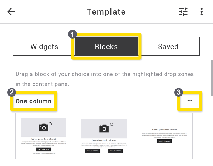
Fig. 34: The Blocks library provides you with a huge collection of ready-made elements.
The block templates are divided into subcategories, whereby only a few examples are displayed in the main category Blocks. You can access the entire collection of blocks in the different subcategories via the three-dot-options menu on the far right (Fig. 34, 3).
These subcategories are available:
- One column,
- Two columns,
- Image left + Text right,
- Text left + Image right,
- Header with and without Social Media icons,
- Navigation blocks with linked elements,
- Editorial, e. g. with image or signature,
- Footer with copyright,
- Logos,
- Buttons,
- Social Media blocks,
- Ratings and surveys,
- Image grids with different layouts,
- Mobile APPs with linked image-logos for Google Play and Apple App Store,
- RSS blocks in various designs,
- YouTube video implementation,
- SmartBot-blocks with programming script (e. g. transferring data from external shops),
- WordPress posts,
- TYPO3 blocks.
In the following, we use individual examples from this list to illustrate the special features of some subcategories.
One column blocks
There are currently 27 differently structured blocks available in the One column blocks area. Only a few examples are displayed on the overview page. To see all the available blocks, please click on the 3-dot icon to the right of the heading „One column“ (Fig. 34, 3). This will take you to the subcategory where all available single-column blocks are listed. You can switch between the list or gallery view option using the icons to the right above the blocks.

Fig. 35: Subcategory ‚One Column‘ with blocks displayed in list mode.
You insert a block into your emailing just like any other element by dragging & dropping it to the desired position. The editing options apply analog to the Widgets, whereby you can edit, add, remove or rearrange individual widgets within a block as you wish.
Example: One column block with image, headline, text and CTA button

Fig. 36: One column block, editing the heading text element.
Fig. 36 shows a one column block consisting of the individual elements:
- Image,
- Heading Text,
- CTA-Button, and
- Footer.
The block has already been inserted into a newsletter design using drag & drop and is now ready for further editing (Fig. 36, 1). Within the block, the heading element (a „Text“ widget) is selected (Fig. 36, 2) and can now be edited individually. Note the associated context menu above the element and the editing menu in the right-hand app panel (Fig. 36, 3).
Don’t forget: Always finalise your entries by clicking on the Save button at the top right of the screen.
Navigation blocks
In this subcategory, we provide several blocks with vertically or horizontally aligned navigations. These can be used internally or externally. Within the newsletter, you can use jump links for a table of content, externally you can link e. g. to different shop areas.

Fig. 37: List of blocks in the ‚Navigation‘ subcategory.
Each element of a navigation block can also be edited separately.
Example: Navigation bar with logo and shop links
Fig. 38: Navigation bar with logo and links to external shop areas.
Fig. 38 shows an example of a horizontally arranged navigation bar. It forms a row that is divided into two columns, with column 1 containing the logo (fig. 38, 1) and column 2, a further block with linked text elements (fig. 38, 2). Here again a block with several columns is embedded, which contain the text links arranged next to each other.
The advantage of this structural arrangement lies particularly in the design freedom regarding desktop and mobile settings. In contrast to the desktop view (horizontal alignment), the columns in the mobile view can be arranged vertically (fig. 38, 3 Stacking).
If the entire block is selected (blue marking line), the corresponding context menu is displayed directly on the block as well as the editing menu in the app panel on the right. The app panel menu indicates that this navigation block consists of two columns.
Each of the columns can be edited individually. To do this, click on the area you want to edit. The blue marking line indicates which area you can currently edit. In the illustration below, the subordinate block in the second column is highlighted in blue. This embedded block in turn consists of several text elements, as you can see from the yellow frame lines:

Fig. 39: Subordinate block with several text elements.
The individual text elements can be formatted and linked separately. To do this, click on one of the text elements – the context menu and the app panel menu change accordingly:

Fig. 40: Edit the individual text elements of the subordinate block.
To add a link to the text element, click on the chain element symbol in the context menu (blue colour = active link available) and select the type of link you require:

Fig. 41: Options for linking. The most common include web addresses and standard links.
You can link your selected text element in many ways: web URLs, email addresses, download sources or various standard links such as online version, logout, profile change or table of contents. In this example, we link to a web address that leads to a certain shop area.
Addition of Anchor-Links
Introduction
Anchor links help you to navigate within the emailing and guiding to predefined points, such as from the table of contents to product categories, forms, CTA buttons, etc.
Multiple anchors can be placed within a page, allowing navigation to different destinations. A ‚Go to the top of the page‘ link or button functions in the same way.
In Maileon Editor 2, placing anchor links is quick and easy. Below you will find two methods for placing an anchor link. Method 1 demonstrates how to place an anchor link within the body of the text, while Method 2 explains how to create an automatic table of contents.
Method 1: Create the anchor links manually while editing your emailing draft
This method is effective if you want to link to individual points of information located anywhere in the emailing.
1. Highlight the text in your table of content you would like to indicate with the anchor link and click on the Insert Link icon (fig. 1).
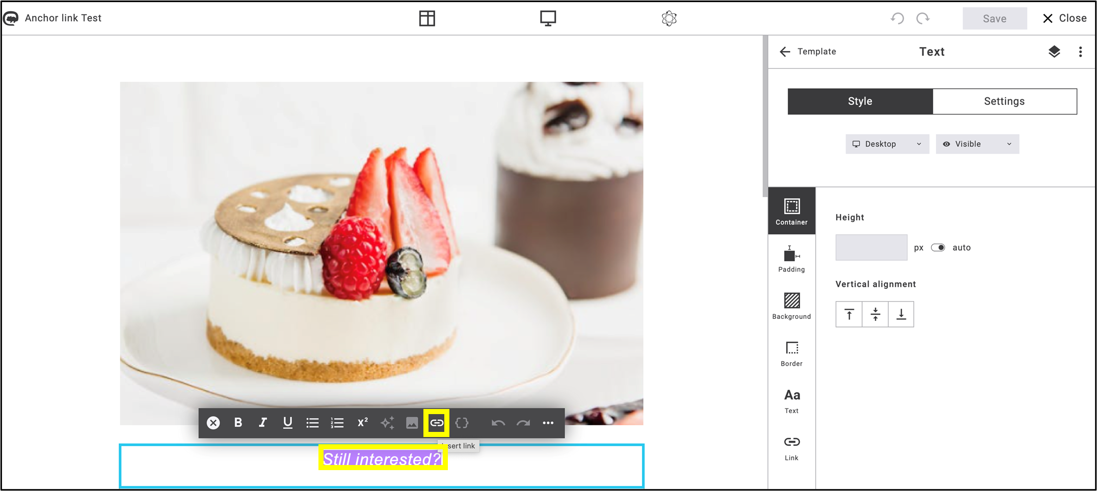
Fig. 1: Highlight the text you want to anchor, then click on the ’Insert link’ icon.
2. Choose the Web Address function and insert a ‘#’ (hashtag sign) followed by the keyword you want to jump to in the table of contents (fig. 2).

Fig. 2: Use a hashtag before the keyword that will serve as the anchor.
Note: Track clicks must be deactivated for the anchor link to work!
Click on Save.
3. Select the text block in the emailing where you want to place the anchor.
- In Settings, select Anchor link.
- Add the previously set keyword to the checkbox related to the anchor link, without the ‘#’ (fig. 3).
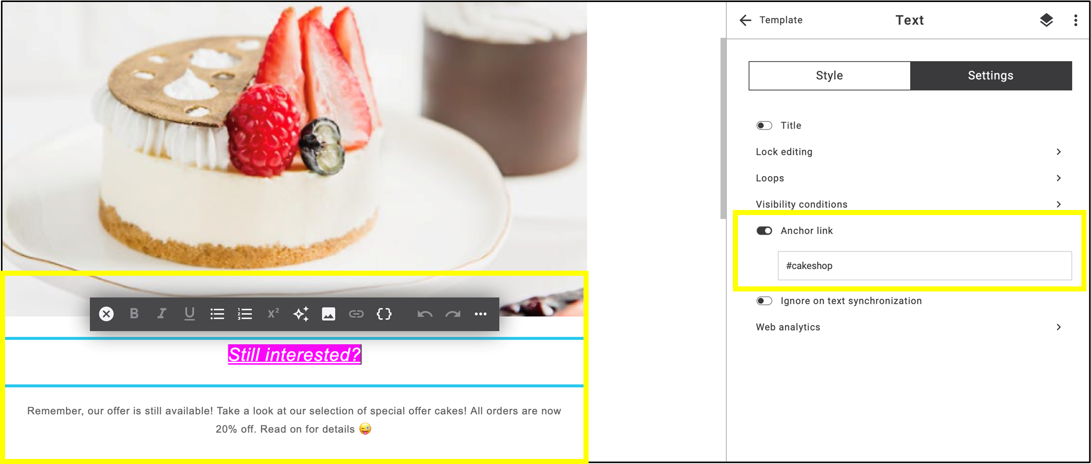
Fig. 3: Follow the steps to set the text box as the destination of the anchor link.
4. Go to Preview and click on the highlighted text (fig. 4).
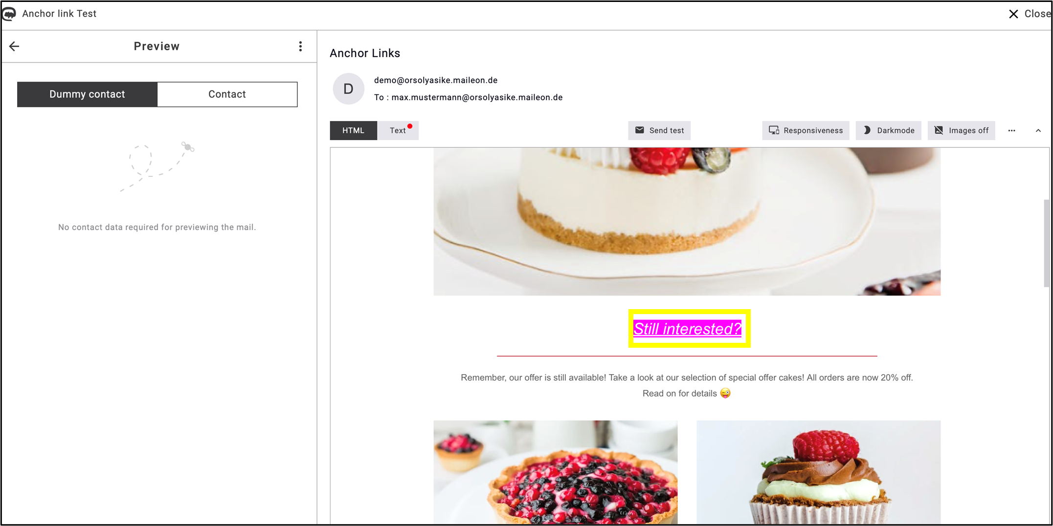
Fig. 4: By clicking the anchor link you will jump directly to the point where the anchor keyword is set.
Method 2: Create an automatic table of contents
This method is useful if you wish to include a table of contents at the beginning/as an introduction of the emailing.
1. Create a new text block for your table of contents and click on the ‘Insert placeholder’ { } icon in the editing bar (fig. 5).
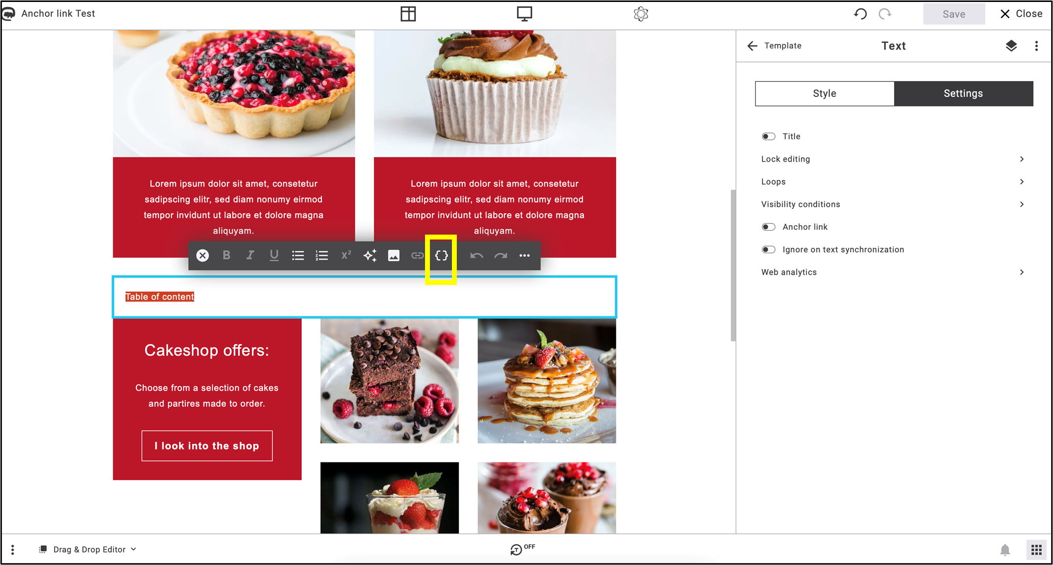
Fig. 5: Select the text and click on the ‘Insert placeholder’ icon to create the automatic table of contents.
2. Select Advanced placeholders (fig. 6.) -> Table of contents list iterator (fig. 7.).
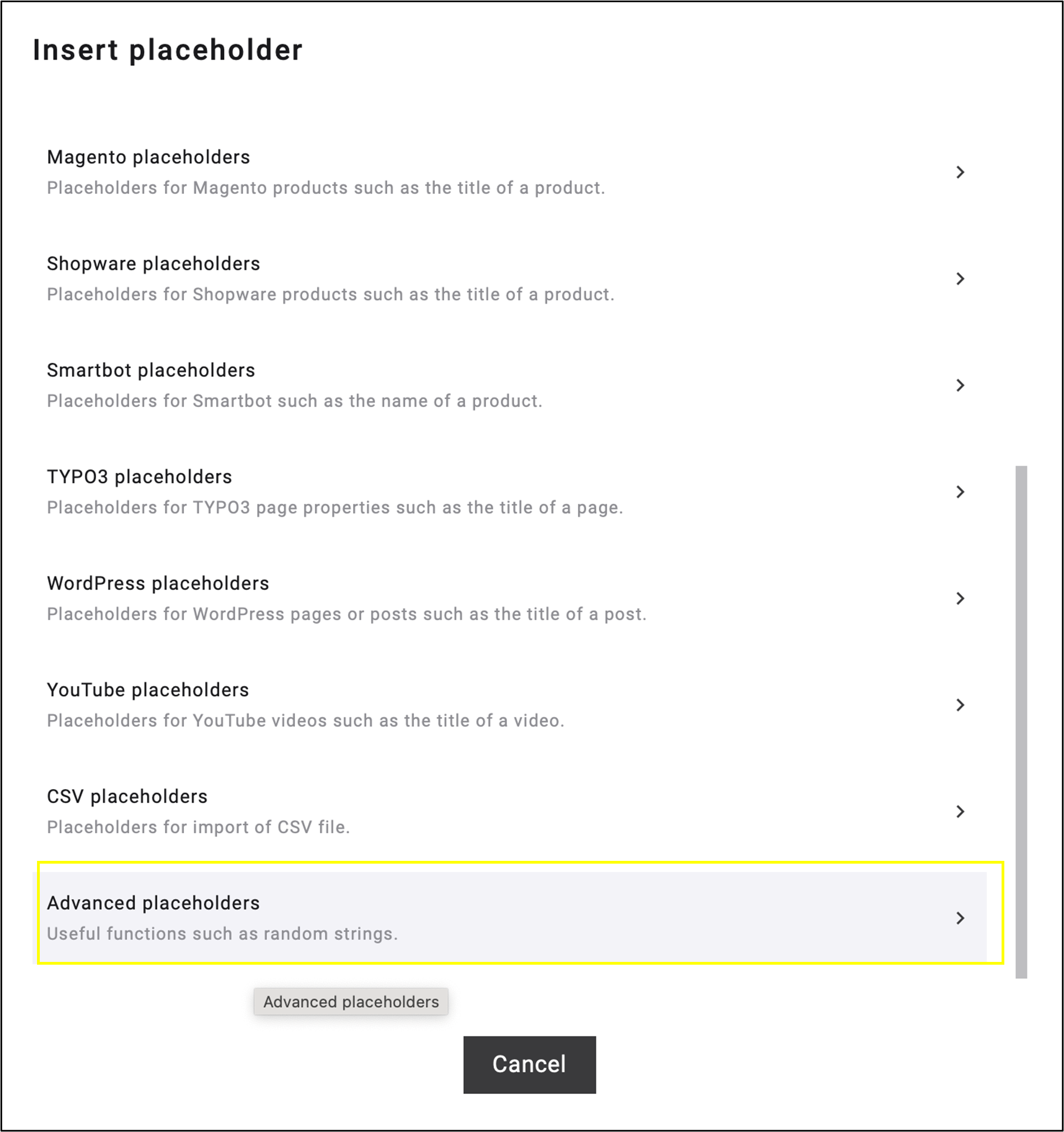
Fig. 6: In the dropdown menu of ‘Insert placeholder’, select ‘Advanced placeholders’.

Fig. 7: In ‘Advanced placeholders’, select ‘Table of content list iterator.’
Note: This function may appear in the Others menu after clicking on the Insert Placeholder icon (fig. 8). You will also find the Table of content list iterator function in the Others dropdown menu (fig. 9).
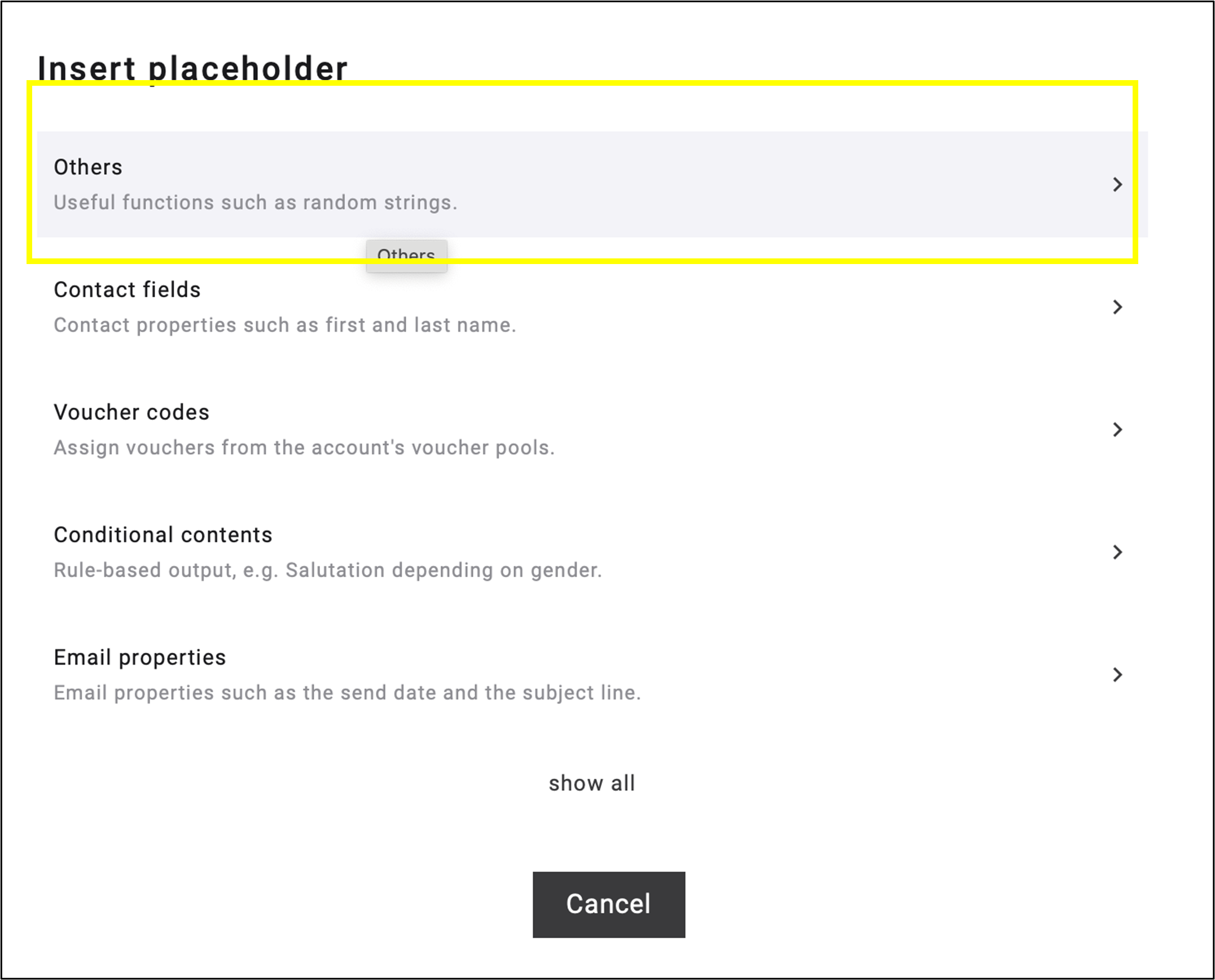
Fig. 8: You may find this function in the ‚Others‘ menu after selecting the ‚Insert placeholder‘ icon.

Fig. 9: ‘Others’ menu also includes ‘Table of content list iterator’ function.
3. After applying Table of contents list iterator, a code will be inserted in your textbox. Delete the dots in the middle of the code that are outside the brackets (fig. 10).
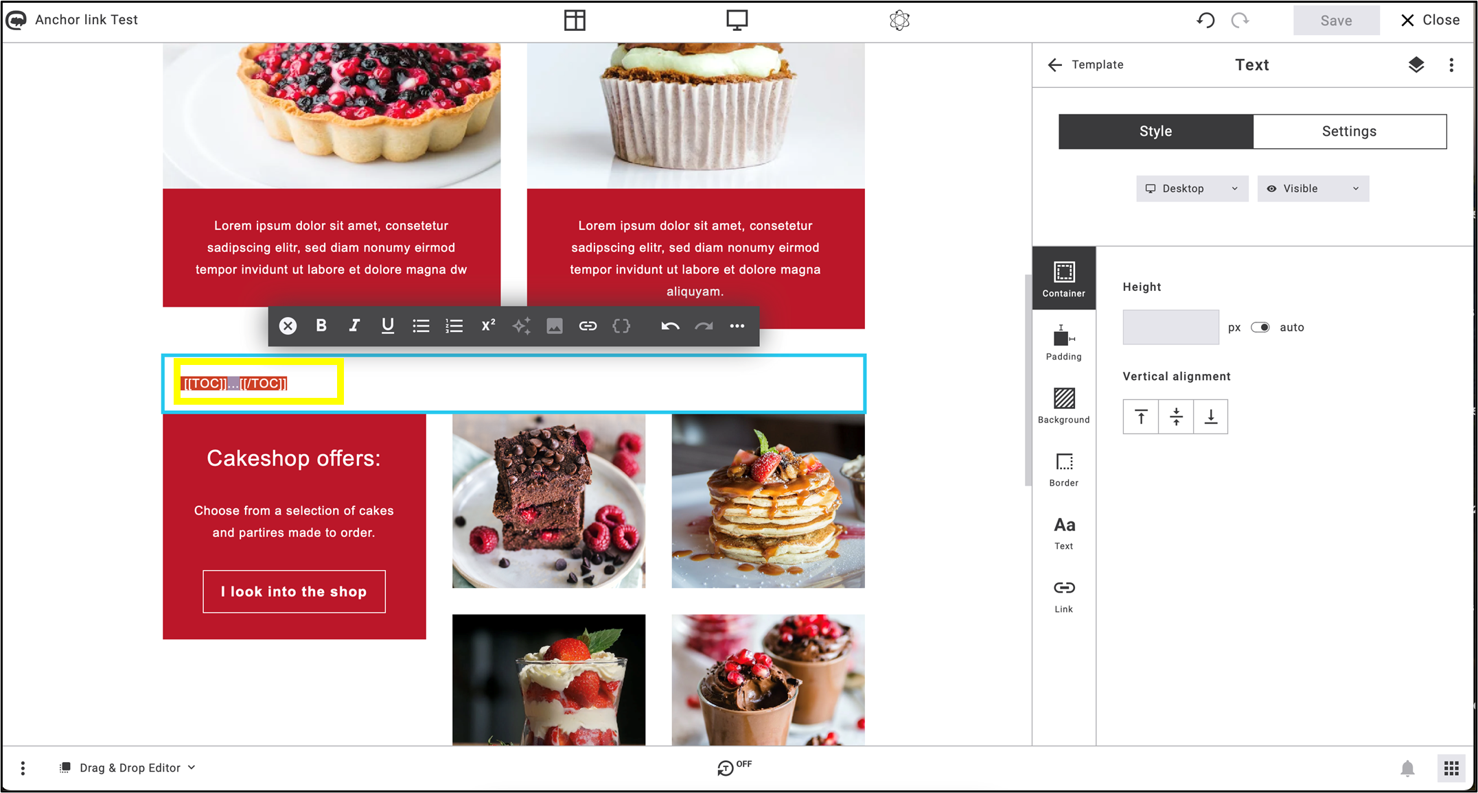
Fig. 10: After the code has been inserted, delete just the dots from the middle
4. Click on the Insert placeholder icon again and among Other placeholders, select Table of content anchor (fig. 11).
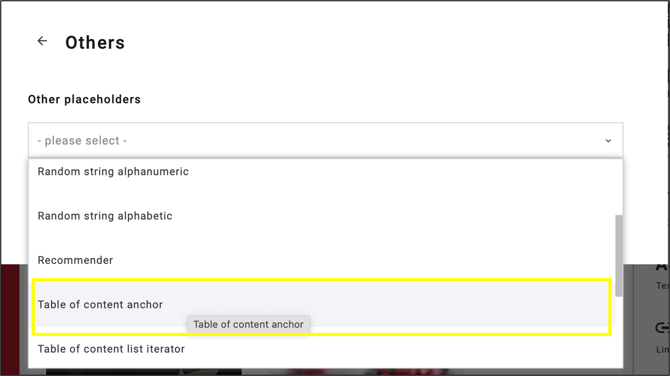
Fig. 11: Choose ‘Table of content anchor’ among ‘Other placeholders’.
The code [[TOC-TITLE]] of Table of Contents Anchor will be inserted into your textbox (fig. 12).

Fig. 12: The code [[TOC-TITLE]], placed within the code for the entire table of contents, has been inserted into the textbox.
5. Define the anchor structure: Create, place and name the blocks in the body of the mailing where the table of contents will link to (fig. 13).
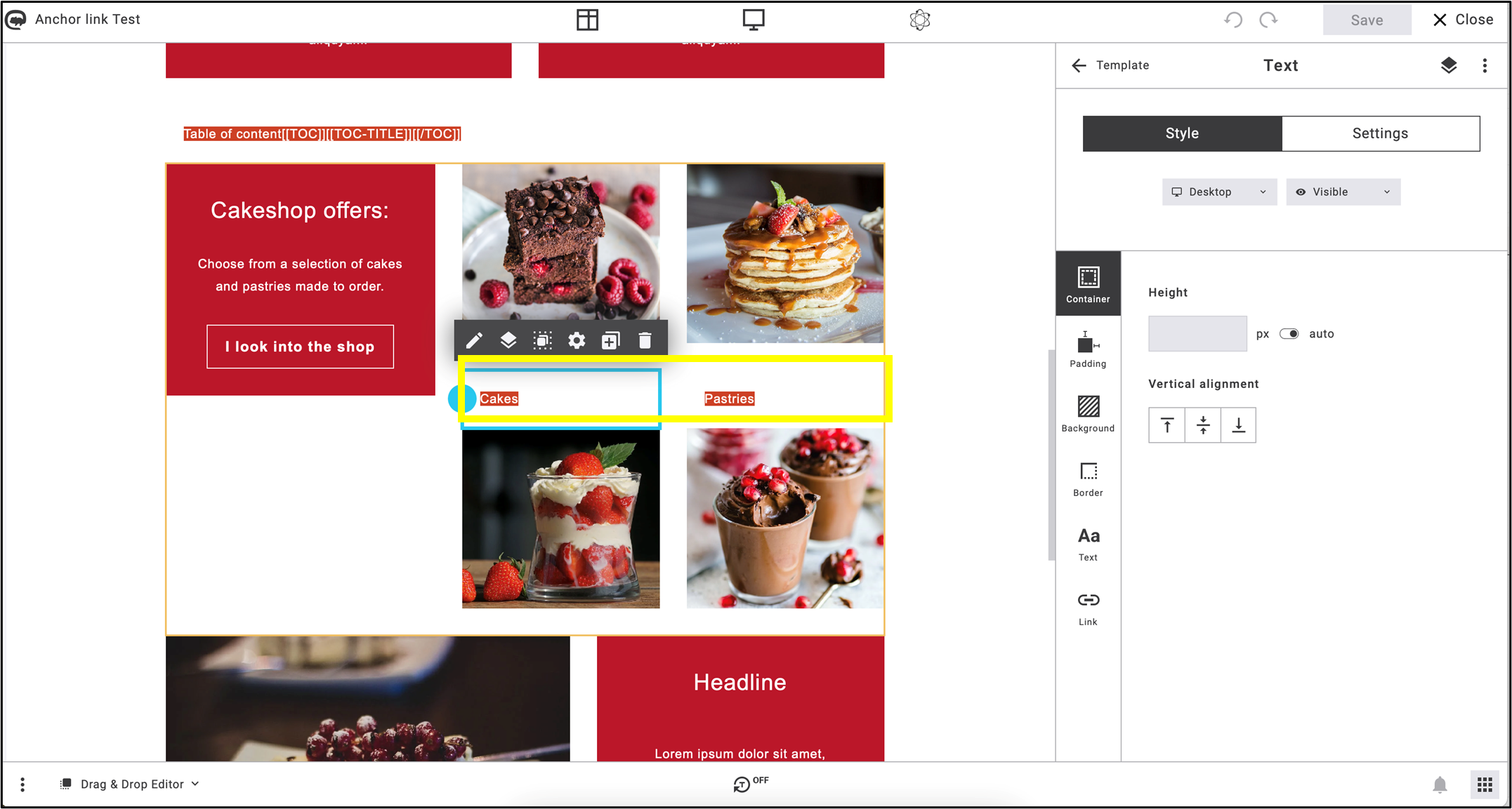
Fig. 13: Edit and assign names to the blocks that the table of contents will link to.
6. Select the text in the edited textboxes, click on Heading in the menu and choose one of the Table of contents (TOC) formatting options (fig. 14).
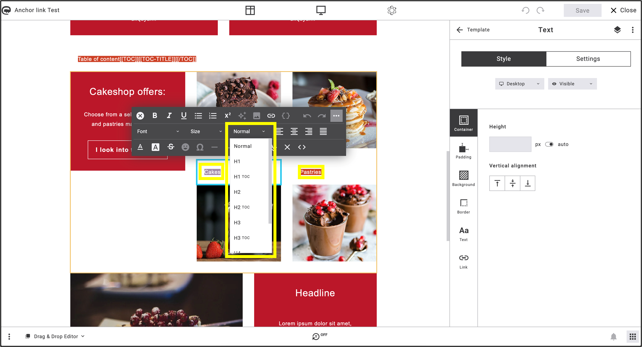
Fig. 14: In ‘Heading’, choose one of the Table of contents (TOC) formatting options.
7. To activate the jump menu between the table of contents and the textboxes, select the [[TOC-TITLE]] code of the Table of contents anchor and click on the Insert link icon (fig. 15). You are able to format the TOC text style as you want.
![the code: [[TOC-TITLE]] is marked, the Insert link button in the menu bar above it is highlighted](https://support.maileon.com/wp-content/uploads/2025/06/Insert-link-on-code.png)
Fig. 15: Select the [[TOC-TITLE]] code and click on ’Insert link’.
8. Select Standard link -> Table of content anchor link (fig. 16).
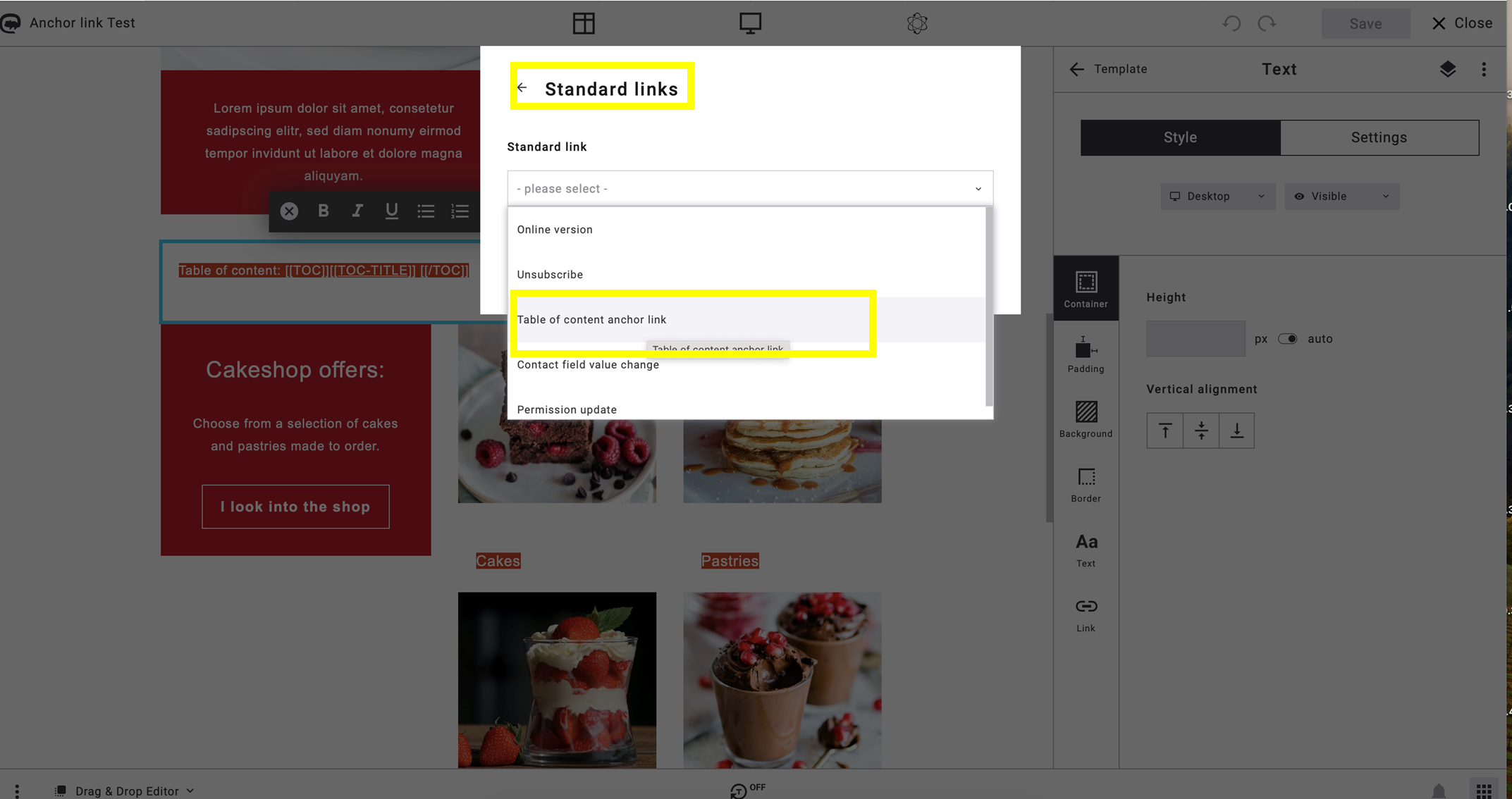
Fig. 16: Select the ‘Table of content anchor link’ to take the final steps.
9. In Preview, ensure that the table of contents — which can be renamed at any time, as shown in the image below — and the selected text boxes are linked using anchor links. The underlined keywords serve as the anchor links (fig. 17).
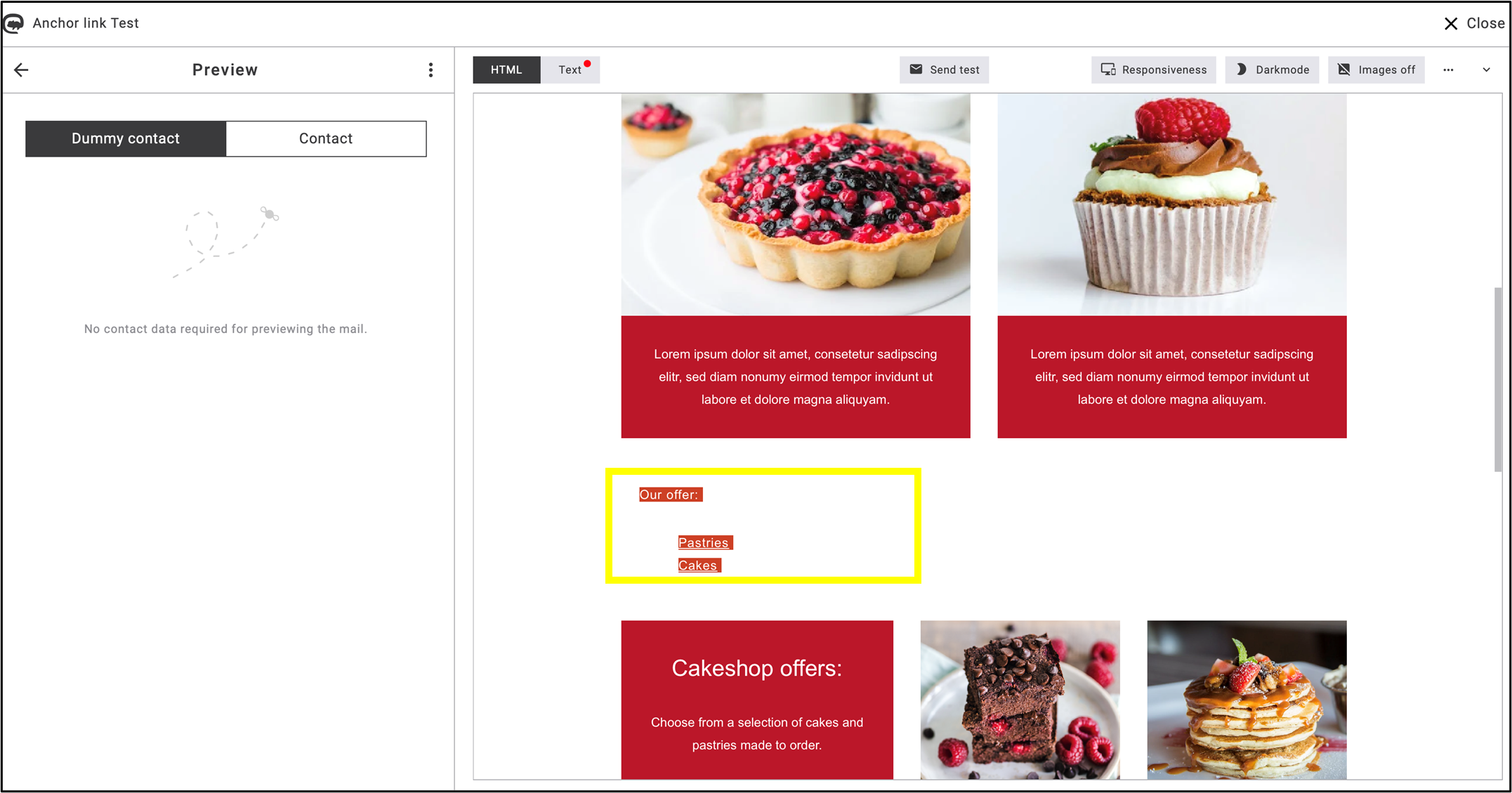
Fig. 17: Running of anchor link preview.
Example of creating Table of contents via TOC-TITLE code
The following newsletter snippet demonstrates how the TOC-TITLE code functions in a completed newsletter (fig. 18).
The elements of the table of contents (‘Themenübersicht’) include the separate anchor links, which appear in separate text blocks below the table of contents, as shown in the highlighted section (‘Highlight des Monats’).

Fig. 18: Anchor links as elements of table of contents.
Each item in the table of contents has a corresponding anchor link and appears as a separate text box within the mailing.
Footer blocks
The standard elements of an emailing always include the unsubscribe link and a link to your privacy policy. We have prepared some footer blocks for this and other typical information at the end of your emailing, which you can quickly and easily customise for your design.

Fig. 42: In the ‘Footer’ subcategory, you will find typical information that fits at the end of an emailing.
Drag and drop the selected block element to the desired position in your emailing and customise the links and layout as you wish.
Example: Unsubscribe and privacy policy link

Fig. 43: Drag and drop the block to the desired position.
Once the block has been inserted, you can format it. Customise the links and change the block design as required. As always, both the context menu directly on the block and the app panel menu with the format options are available to you.

Fig. 44: Inserted footer block is ready for editing with open menus.
When customising the link, you can see by clicking on the unsubscribe text that the unsubscribe link is already correctly provided with the standard link „Unsubscribe“. The „Privacy policy“ text is also already linked to a sample address. You only need to open this link and replace it with the URL to your desired website. That’s it!

Fig. 45: The target link for the „Privacy Policy“ text can be easily replaced here.
For a detailed description of how to format a text block and link text, please read the section „Editing a text block“ in the Widgets area.
Please note: Save your changes when you have finished editing.
SmartBot Blocks: Dynamic shop connection
SmartBot blocks are a special form of prefabricated blocks: these contain scriptlets with placeholders that are linked to an external shop, for example. When integrating them into your newsletter design, you initially only see the programming script or the placeholders. The associated data is obtained from the shop and updated at the time of dispatch.
Individual Blocks
You can modify existing block templates as you wish. To ensure that your customised blocks remain permanently available, you can save them in a separate folder. This means they are not only available for the current project but also for all other newsletter projects. You can even make these files available across all your other accounts.
We will illustrate how to
such a block using an example in which we will guide you through the process step by step.
In our example, we want to create a three-column template block with images and CTA buttons. As there are no three-column templates available in the section Blocks, we will simply start with an existing two-column block and then adapt it to our requirements.
Creating an individual block
1. Select a two-column block template
Click on the first two-column block below „Two columns“ (1) and hold down the mouse button. Drag the block to the desired position in your design (2). A possible insertion area is always coloured blue with the text note „Drop block here“:
 Fig. 46: Choose a ready-made block template and adapt it.
2. Insert block in draft
Releasing the mouse button now inserts the block at the desired position in the draft (drag & drop), and the height of the area is adjusted to the dimensions of the block. Now you see the block with text and image placeholders:

Fig. 47: Ready-made two-column block template with image placeholders.
To prevent the new block from „sticking“ to the block above, we add a spacer widget at the top. To do this, go to the Template > Widgets area in the app panel and add the „Spacer“ widget above your block using drag & drop.
 Fig. 48: Inserting a spacer widget creates distance to the adjacent element.
3. Extend the block by one column
To add a third column to your block, which is structured in the same way as the existing columns, first select the entire block. To do this, click anywhere in the block element area, e. g. on the left-hand image placeholder. A blue link appears around the picture element and a yellow line around the entire block. Now click on the left-hand layer symbol in the context menu to capture the entire block (the parent element) with the selection:
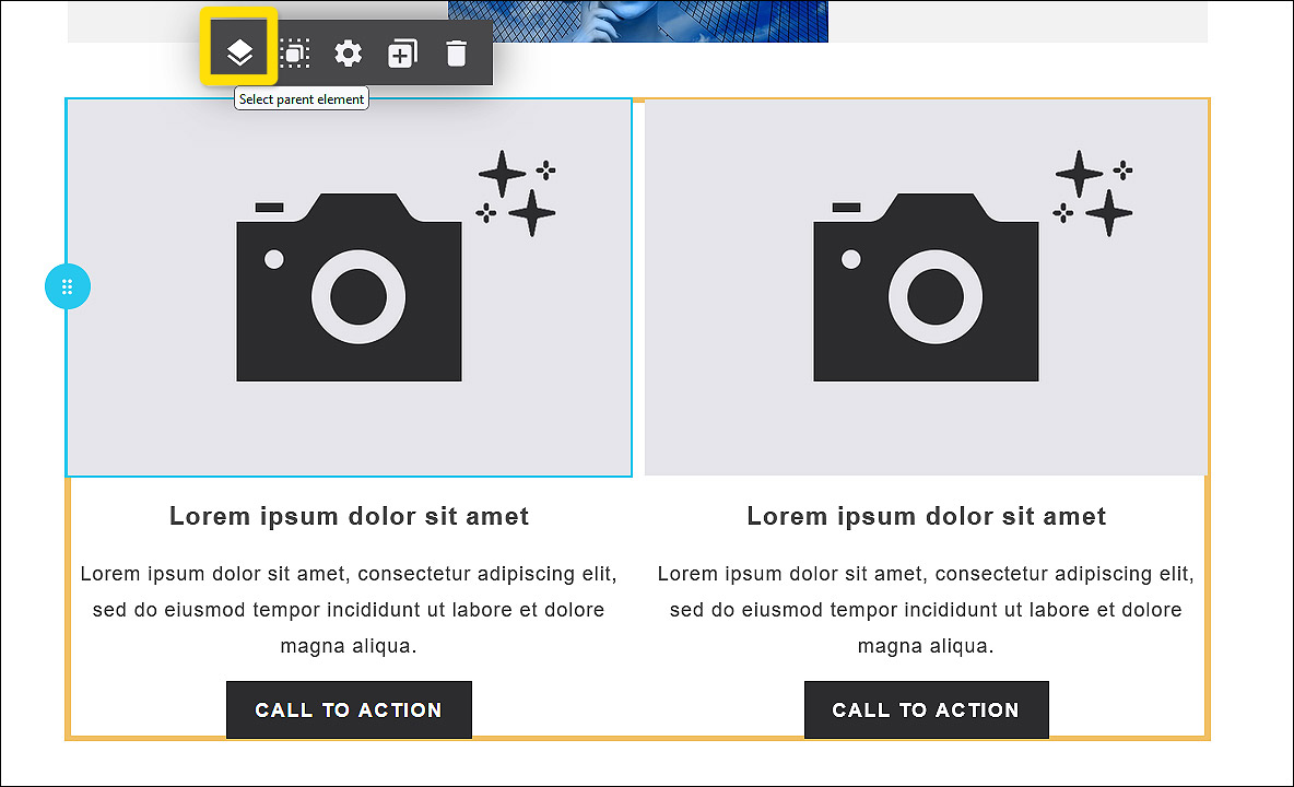 Fig. 49: Marking the entire two-column block will open the column-menu in the app panel.
The app panel menu changes and now shows the options for the entire block. Click on the plus symbol to the right of „Column 2“ to insert a similar block as a new column or klick on the button Add column:
 Fig. 50: Adding a new column to your block is easy and convenient in the app panel.
Done with just one click!
The new column is inserted to the right of the existing columns with just one click (fig. 51, 1). The app panel menu now displays three columns (fig. 51, 2). The column widths are automatically adjusted so that all columns have the same width (fig. 51, 3):
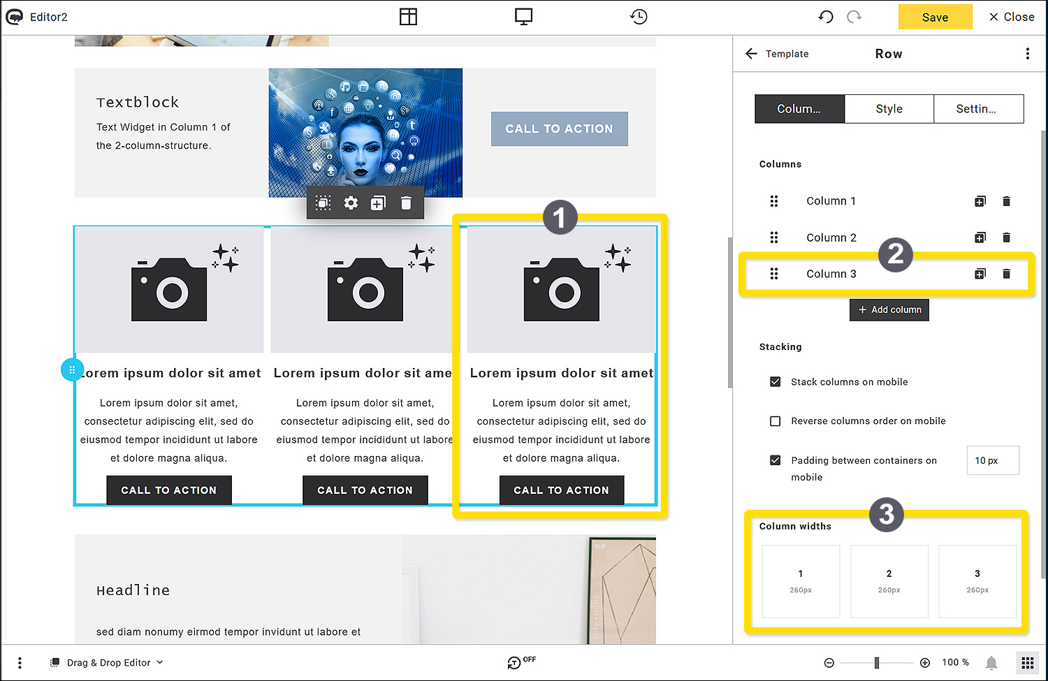 Fig. 51: Adding a new column to your block is easy and convenient in the app panel.
First, save your newsletter draft using the Save button at the top right.
4. Save the new block as a template
Once you have completed your new template block, you can save it for further use. To do this, click on the 3-dot menu on the right in the app panel header and then on the Add to saved blocks command:

Fig. 52: Save your block via the 3-dot menu.
A pop-up window opens. Enter a name in the Name field (in the example: „Three column block“).
You may want to add tags to the block as required, which can later be used as search criteria to quickly find what you are looking for among all your saved elements. To do this, click on the „+“ next to the Tags field and enter tag expressions as required.
So far, only the default folder is offered here as a storage folder. We will show you how to expand your folder structure in step 5. Click on the Save button:

Fig. 53: Give your block a descriptive name.
5. Find the new block in the Default folder
Change to the Saved area:

Fig. 54: Your individual blocks are stored in the area ‚Saved‘.
Here you can now see your new template block „Three column block“ in the Default folder with a small preview image, including the name and file size:

Fig. 55: Your individual block is shown unter ‚Blocks‘ with a thumbnail, name and date size.
6. Create a new folder
In the course of your work, you will probably save many blocks, e. g. both ready-formatted blocks and empty block templates. To keep an overview here, you can add your own folders to the folder structure. To do this, click on the folder symbol next to the dropdown in the Saved area.
The pop-up Saved blocks shows your storage area with the Default folder. You can see the folder in the left-hand column and your new block template in the right-hand column. To create a new folder, click on the + Add folder button above the Default folder:
 Fig. 56: Add a new folder in the Saved blocks area.
A new folder now appears below the Default folder. As soon as you move the mouse over the New Folder, three menu icons appear to the right of the name. Click on the cogwheel icon to configure your folder (name, sharing options):
 Fig. 57: Change the settings of the new folder in the Saved blocks area.
Name your folder in the Name field. In the Sharing options, you can specify whether your folder should only be available in this account or in multiple accounts (if available). You can also define additional access rights. Select the desired option by clicking on the corresponding radio button. Then save your settings with the Save button:

Fig. 58: Name the new folder and choose the sharing options.
7. Move the template block to your new folder
After saving, you will automatically return to the Saved blocks overview. Click on the default folder where your new template is still located. Now drag and drop the „Three column block“ volume block from the right-hand area to your new „My Block Templates“ folder and drop it there.
Please note: Alternatively, you can click the checkbox on the block and then move your block to another folder using the Move elements command via the Bulk actions above it. This procedure is particularly useful if you want to move several elements at the same time.

Fig. 59: Move the saved block to your new folder ‚My Block Templates‘ per drag and drop.
Now close the Saved blocks pop-up using the „X“ in the top right-hand corner. This will take you back to the Saved area in the app panel. You will find your new „My Block Templates“ folder as an additional entry in the Dropdown folder. The number on the right shows how many elements are stored in this folder:

Fig. 60: The new folder ‚My Block Templates‘ is shown in the Folder dropdown.
8. Overwriting a block
If you want to change something in one of your blocks, you can simply overwrite it. To do this, go to the Saved area (fig. 61, 1) and click in the folder dropdown on the folder where your block is stored (fig. 61, 2). Then drag the desired block (fig. 61, 3) into your draft and drop it on a blue insertion area (fig. 61, 4):
 Fig. 61: Insert your new block into the draft.
The block is now inserted and ready for editing:

Fig. 62: Inserted block is ready for editing.
Now you may want to change the style of the CTA-button in order to adapt the block to your corporate design. Therefore, you can copy and apply the style of another button element in your draft.
Click on the CTA-button to mark it (see the blue marking line), the app panel menu changes and shows the Content area of the Button:
 Fig. 63: Choose a CTA button to copy its style to your new block.
Please note: The next step (***going to the Style settings of the button and checking for the colour details***) is not necessary for the process of transferring the whole button style to other buttons – we have only included this step for the sake of general understanding. Therefore we have framed this part with 3 asterisks.
***
Click on the Style area (fig. 64, 1) in the app panel to get to the styles of the button, then choose Button (fig. 64, 2) in the left vertical menu and click on Background (fig. 64, 3) in the horizontal submenu. Now the colour settings for the Initial view (fig. 64, 4) of the button are displayed. Here you see a coloured sample square and the hexadecimal code (#96AAC1) of the Background colour (fig. 64, 5):
 Fig. 64: All style details of a CTA button are available in the app panel.
***
Now click on the 3-dot icon in the head row of the app panel and select Copy style to clipboard. This command will copy all style settings of this button, not only the Initial colour, but also the Hover colour (if one is set), and all other settings (General, Padding, Border, different Desktop and Mobile settings, etc.):

Fig. 65: Copy the whole styling set to the clipboard.
If the copying was successful, the pop-up “Styles copied” appears for a few seconds:

Fig. 66: Styles successfully copied.
After it disappears, return to the 3-point menu. There are two ways of applying the copied style to your buttons in the block:
10. Apply style to all buttons
Use this comand if every button in the draft should have the same design.
Select Apply style to all buttons in the 3-dot menu.

Fig. 67: After copying the button style to the clipboard, you can apply it to one or all buttons.
If the action was successful, the pop-up “Styles applied” appears for a few seconds:

Fig. 68: Style is applied to all buttons in your draft with just one click!
As soon as it disappears, you can see in your draft that the buttons in your block have changed and now show the same design as the button in the element above:

Fig. 69: CTA button style in the individual block is now identical to the element above.
Done with just a few mouse clicks!
11. Apply style to one button
After copying the style to the clipboard and the prompt “Styles copied” disappeared, click on the first button in your block to mark it (fig. 70, 1), then go to the 3-point menu in the app panel head row (fig. 70, 2) and select Paste style (fig. 70, 3):

Fig. 70: Applying CTA button style to just one selected button with the comand ‚Paste style‘.
The prompt “Styles applied” pops up for a few seconds if the action was successful. See the change in the position and colouring of the button:

Fig. 71: CTA button layout in column 1 has changed according to the applied style.
As you see, the button has not only changed its colour, it is also far more distanced from the text above. Of course, you could make more changes if you want to, e. g. place the button nearer to the text. We will do this extra modification, subsequently copy the modified styles to the clipboard and then apply it to the other two buttons in the block. Follow these steps (fig. 72, 1– 6):
- Click on the left button in your block to select it; the app panel changes to the Button editing options.
- Go to the Style area and
- select Button in the vertical left menu.
- Select Padding in the horizontal submenu. Below you see 4 icons surrounding a padlock symbol.
- The one on top is highlighted and the field to the right shows an assigned
- padding value of “60 px”. Delete the field entry “60” and click ENTER:

Fig. 72: The numbers 1–6 demonstrate the steps to change the padding of the selected CTA button.
The CTA-button is now horizontally aligned with the other two buttons:

Fig. 73: All three CTA buttons have now the same top padding.
Next you delete also the padding at the bottom. Go to the app panel (the Padding menu is still open) and click on the icon below the padlock symbol (fig. 71, 1). It is now highlighted and the field on the right shows the according padding value of 30 px (fig. 74, 2):

Fig. 74: All three CTA buttons have now the same top padding.
Delete the number “30” in the field (fig. 74, 2) and click ENTER. Now the bottom padding is also gone, and we can finally apply the modified style to the other two buttons:

Fig. 75: All three CTA buttons without top and bottom padding.
Make sure the first button in the block is still selected. As before, go to the 3-dot menu in the app panel head row and select Copy style to clipboard:

Fig. 76: Copy the style of the first CTA button to the clipboard.
Your modified button style is now copied, and you can apply it separately to the other two buttons. For that select the next button, go again to the 3-dot menu in the app panel head row and select Paste style.

Fig. 77: Pasting the copied style of the first CTA button to the next one.
The pop-up “Styles applied” shows for a few seconds.
Repeat the last steps to apply the style to the last button as well.
We recommend saving your work with a click on the Save button in the top right corner of the Editor window.
Now your modified block is ready!
The last step is to overwrite the old block in the folder My Block Templates. First select the whole block by clicking somewhere into your block. The context menu appears. Click on the layer icon “Select parent element” to extend the marking to the entire block:

Fig. 78: Pasting the copied style of the first CTA button to the next one.
The blue marking line is now surrounding the whole block. The app panel changes to the according options. Go to the 3-dot menu in the head row of the app panel and click Add to saved blocks:

Fig. 79: Save the newly styled version of your 3-column-block.
Please note: If you have not yet saved your content, you will now be asked to do so. In this case, confirm by clicking on Save content.
Now the pop-up Add to saved blocks appears. Select the folder “My Block Templates” (fig. 80, 1), then click into the Name field (fig. 80, 2).
Please note: For a few seconds the saved block names of the selected folder shows beneath the Name field. Then you can directly click on the block name to overwrite the old block version, here “Three column block” (fig. 80, 3):

Fig. 80: Overwrite the old version of your 3-column-block.
Tip: If the pop-up with the names of existing blocks has already disappeared, click once outside of the Name field and then click again inside the Name field. The pop-up will appear again for another few seconds.
Alternatively, you can write the whole name into the Name field. But make sure to use the exact same name the old block is saved under, otherwise you will have two different versions of your block. If you are finished with editing, click the button Save.

Fig. 81: Finish the overwriting process with the button ‚Save‘.
Now the pop-up Save element appears to ask whether you want to override the existing element or create a copy with the same name plus a copy suffix. Click on the Override button:

Fig. 82: Confirm the prompt to override the old version of your block.
Mission complete!
12. Deleting a block
To delete your saved block, click on the folder icon to the right of the folder dropdown. The Saved blocks pop-up opens. Now click on the desired folder and then in the right-hand area on the element to be deleted. This will automatically click on the corresponding checkbox.
Now select the Delete elements command in the Bulk actions dropdown. Confirm the prompt by clicking on the Delete button (the number on the button shows how many elements have been selected for deletion):

Fig. 83: The delete button shows the number of selected elements.
Now it’s gone!
Preview
The preview function allows you to check your newsletter on several levels before you send it. The layout window always shows the desktop version; here you can see the arrangement of all elements as they are displayed on large screens. All placeholders are also displayed in their code form.
Good quality management naturally includes checking the final appearance of your mailing. This means, testing with properly filled placeholders and in different screen sizes, e. g. tablets and mobile phones. For this purpose, we provide you with a special preview window with numerous functions. This allows you to put your newsletter through its paces before you send it to recipients.
The preview icon is listed in the app panel overview. As you will probably use the preview frequently, it makes sense to drag the icon to the top menu bar. This gives you direct access to the preview function at any time (see section „The top menu bar“).
Fig. 84: Preview icon in the app panel overview.
Preview window functions
Click on the preview icon to call up the preview window. The preview view is divided into two areas:

Fig. 80: The preview window is divided in two parts, the contact details and the preview display.
Left column: Contact details

Fig. 81: Create a preview simulation with a dummy or selected real contact.
In the left-hand area of the preview window, set the contact details with which you would like to check your design. This concerns the placeholders for names and/or dynamic greetings that you have set up in your emailing. You can either use a dummy contact to check the logic of the salutation formula or use real contacts from your database.
The components of the left-hand preview window from top to bottom:
- Header (1): The arrow on the left ends the preview and takes you back to the editing window. In the centre you will see the title „Preview“. You can set the preview app as a favorite using the three dots on the right. Favorite apps are displayed at the top of the app list in the app panel.
- Contact buttons (2): Here you can switch between a simple dummy contact on the left and your real contact list on the right. When you click on the real contact list, further options for selecting the desired contacts appear.
- Drop-down lists and automatic run simulation (3): You can select different types of lists and the lists they contain from your contact list for testing. The symbol with the crossed arrows selects contacts in random order during automatic scrolling. The symbol with the dashes and the small arrow on the far right activates or stops the automatic scroll. This selects all contacts in the set list one after the other and always displays them for a few seconds in the right-hand preview window instead of the placeholder.
- Contact (4): The field shows the email address of the currently selected contact. You can use the arrows on the right and left to scroll manually through the list of contacts you have selected.
- Required contact field data (5): The note indicates that sending the newsletter may or may not fail due to missing contact information. If you use dynamic address logic or contact fields, you should set up a fallback value in the event of missing contact data (see p. Classic editor, text settings).
Right column: Preview window

Fig. 82: Elements of the right column of the preview window.
In this part of the preview, your emailing is displayed as the recipient will see it later. Here the emailing is simulated with real contact data instead of placeholders. You can use the vertical scroll bar on the right-hand side to navigate through the entire emailing and check all design elements.
From top to bottom, you can see in the right-hand column of the preview window
- the basic information (1),
- the view menu with further options (2) and
- the emailing preview with filled placeholders (3).
Basic information (1): At the top left, you will first see the subject of your emailing, below it your sender address, and then the currently assigned recipient address (according to the settings in the left-hand column of the preview window; 4).
The basic information can be shown or hidden using the small arrow on the right-hand edge of the view menu (2), for example to enlarge the preview area of the emailing.
View menu (2): All view options for the preview are listed in this bar. From left to right:
- HTML/Text: The HTML view is set by default so that you can see the emailing in its design with images and active links. For recipients who prefer the text version, the emailing is displayed without images and layout, only with text and link information. The view menu then appears with fewer options.

- Send test: Click this button to send yourself a test version of the emailing. Enter your e-mail address in the recipient field. You will now receive a test of the emailing with the contact details that were set in the preview at the time of the test sending (3).
 If you only want the text version to be sent, please click on the „Send text version only“ slider.
 - Responsiveness: In draft mode, you will see your emailing in the desktop view by default. To be able to check whether the mobile view is also error-free in the layout, we offer you several options. Click on the button to display another bar below the view menu with a number field and various icons in which you can test different screen sizes. This allows you to check your mobile version settings in detail; for example, elements that were arranged next to each other in the desktop view may be displayed one below the other.

Assistant: Tips and tricks
The Assistant accompanies you during newsletter creation and provides you with useful tips and hints. It recognises critical situations or error-prone areas and then notifies you via the bell symbol at the bottom of the Editor 2 window.

Fig. 83: Assistant app in the app panel.
The app is divided into two areas: „Notes“ and „Bookmarks”.

Fig. 84: Assistant app options, divided in ‚Insights‘ and ‚Bookmarks‘.
Click on the screw symbol in the header on the right to access the app settings. Here you can set how high the assistant’s sensitivity should be under „Chattiness level“. The points that the assistant checks are listed under „Muted insights“. You can set this app as a favorite using the 3 dots on the far right. It will then be displayed in the app list before the non-favorite apps.

Fig. 85: Settings options of the assistant app.
The assistant can recognise these problems. It will then give you a hint:
- Dummy Text: If dummy text (e. g. Latin text) is still present somewhere in your newsletter draft.
- Form of address: If the address logic is not correct. This may be the case with dynamic texts.
- Links too close: Usability suffers when textlinks are positioned very close to each other.
- SPAM trigger words: If the text contains terms that could cause the newsletter to be declared as SPAM.
- Tap target size: If the size of links is unsuitable.
You can reduce the list of problems to be recognised by clicking on the bin icon next to the entries to remove an entry. The assistant will then no longer check this item.
Editor Settings
You can set up different default settings for the editor and/or the HTML editor to make your work easier. In the app panel overview, the app Editor settings is shown with a cogwheel symbol.

Fig. 86: The cogwheel icon for the Editor settings.

Fig. 87: Editor settings options.
In the Editor settings, you can customise these three points to suit your requirements:
- Dockshift: Setting the quick access bar in the header. In this area, you can set the type of notifications and select the apps to be displayed in the quick access bar in the header of the Editor.

- Auto save: Automatic saving according to time or work steps.

- HTML & Text editors: View options for the HTML editor.

Specify here how the code should be displayed on the HTML level. There are several colour schemes, fonts and font sizes to choose from, and you can also change the arrangement of the lines of code and other options, e. g. display a search bar to help you find certain places in the code more easily.
Backups
Use the Backups app to create a backup of your work in the current version. This allows you to protect the status of your work from changes made by other users or from data loss.
Fig. 88: Create backups with the ‚Backups‘ app.
How to create a backup:
- Click on the app icon (clock with arrow symbol). The Backups app opens in the app panel.
- In the Backups app, you will see the header bar at the top with the back arrow on the left-hand side to return to the app panel overview. The app name is shown in the centre as a heading. The three dots on the right-hand side take you to the other options. Here you can set the app as a favourite; thus it will always be displayed at the top of the app panel overview. To create a new backup, click on the + Create backup button at the bottom.

- In the pop-up, enter a name for your backup (at least 3 characters). Add optional text in the description field to explain the status of your work in more detail. Finally, click on the Add button to save your backup.

- The backup is now listed in the app window, along with other options such as the search bar and the dropdown on the right, which you can use to limit the display of backups to individual creators. This is recommended if several users are working on the same emailing draft. It allows individual users to find their different editing statuses more quickly.

You can see the name and additional description in the entry line. The rounded arrow on the far right resets the emailing draft to the status of this backup.
Please note: This action cannot be undone. Use the rubbish bin symbol to delete this backup.
Attachments
The Attachments app allows you to send various attachments with your emailing. Please note the following limitations regarding the permitted file sizes and data volumes:
- Dynamic attachments: max. 3 MB
The server must provide the file in less than 5 seconds and must not use URL redirection (example: response code 301). - Maximum number of attachments: 10
The attachments may be static and/or dynamic or mixed. - Maximum file size of the emailing incl. attachments: 7 MB
The system is automatically throttled for batch mailings if the cumulative total size of the mass exceeds 2 GB. Dynamic attachments are estimated at 3 MB.
We recommend using download links instead of attachments wherever possible, as attachments consume a lot of resources on both the sender and recipient servers. This can lead to problems with deliverability.

Fig. 89: ‚Attachments‘ app in app panel overview.
How to add one or more attachments to your draft:
- Click on the app icon (paperclip). The Attachments app opens in the app panel.
- In the open Attachments app, you will see the header bar at the top with the back arrow on the left-hand side to return to the app overview. The app name is displayed in the centre as a heading. The three dots on the right-hand side take you to further options. Here you can e. g. mark the app as a favourite; thus it will be always displayed at the top of the app overview.
- To add a new attachment, you have two options:

a. Click on the Add attachment button on the left to select a file from the media library in Maileon.
b. Click on the Upload attachment button on the right to upload a file from your local data carrier. - After adding, the list of attachments is displayed with name, file type and size. Move the mouse over one of the list entries to display the options menu for this file. You can rename, download or delete the file here.
